Tutorial 1: Map themes
In QGIS 3 it is possible to create map themes which remember what layers are visible and what layer styles are used. This feature provides possibility for quick switching between different map styles and is particularly useful in cases when different data sets are available for the same area. In this rather short and simple tutorial we will create a map with two themes. The data for this tutorial is available in this zip-archive.
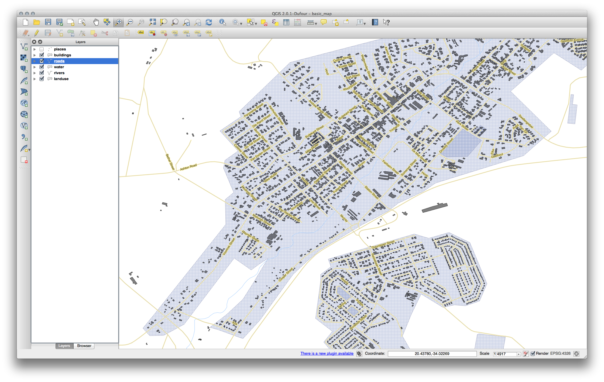
1. Start by opening start.qgs map in QGIS. You will see that the file consists of three layers:
- Traffic accidents
- Roads
- Land use
Assume that we want to have two different maps:
| Map | Traffic Accidents | Roads | Land use |
| 1 | Show | Color according to type | Show in different colors |
| 2 | Do not show | All of the same color | Show in different colors |
2. We will begin by creating a theme for the first map. All the requirements for the first map are already in place, so we only need to save the current state as a map theme. Click on the ![]() icon in the layers window and select Add theme.
icon in the layers window and select Add theme.
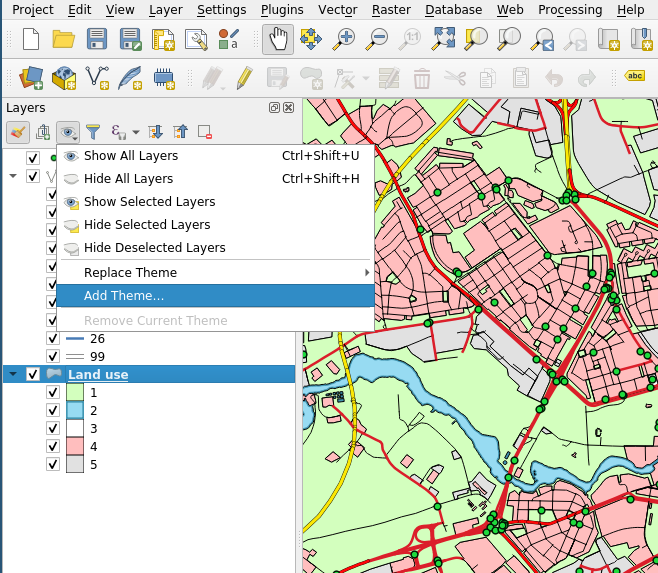
3. Give the theme name Map 1 and click OK. The current theme has been saved.
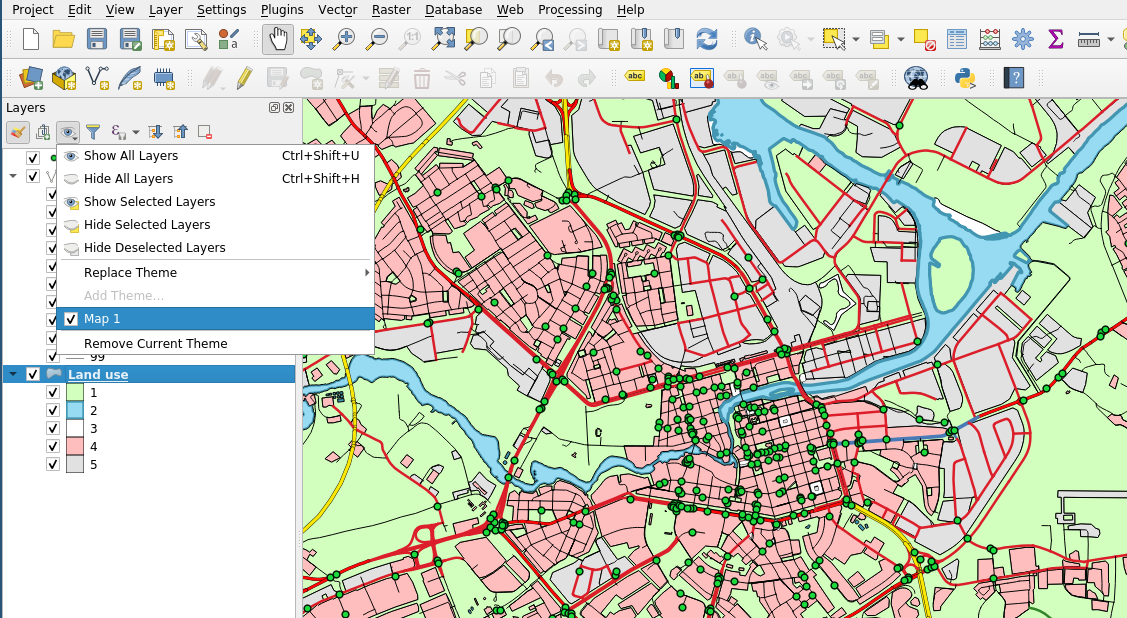
If you now click on the ![]() icon again, you will see that the theme named
icon again, you will see that the theme named Map 1 has appeared in the menu and is selected.
4. Now, let's start preparing the second map. We begin by hiding all the traffic accidents. Click on the checkbox on the left to the layer Traffic accidents.
5. Before we proceed to changing the layer style, let's save the current state. Click again on the ![]() icon and select Add theme..., name this theme
icon and select Add theme..., name this theme Map 2. Now you have two map themes: Map 1 and Map 2.
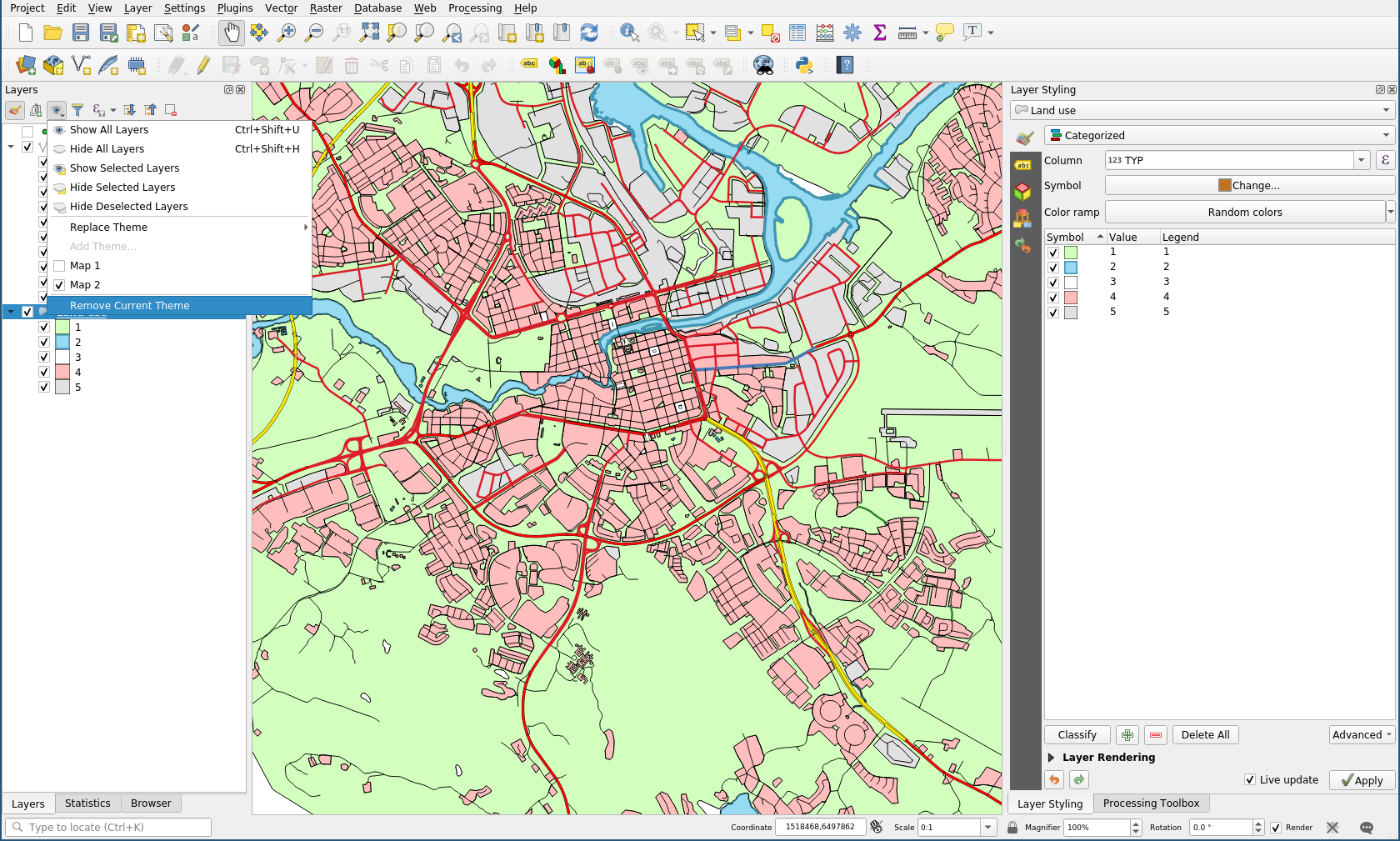
Try to switch between two themes and you will see that it toggles the visibility of the traffic accidents layer. It means that when you created a theme, QGIS remembered the visibility states of all layers.
6. Now we need to make roads layer look be visible but look differently in the two themes. We will do that using Layer styles. Right-click on the roads layer, select Styles ‣ Add... and enter name Single-color.
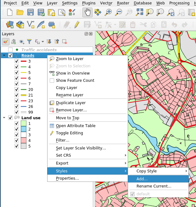
Now you have two styles for the roads layer: default and Single-color. Let's rename default into Multi-color. Switch to default style by clicking on it and then go into the same menu again and click Rename Current.... Enter the new name and click OK.
7. Switch roads layer back to Single-color style by using Styles menu. Now use Layer Styling menu to switch from Categorized to Single symbol symbology (or, as an alternative, you can adjust colors of all classes). This will make all roads to be drawn using the same symbol, independently on their type. Select the color as you see fit.
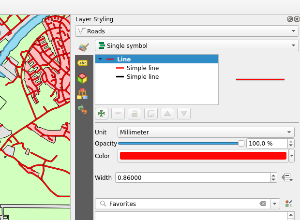
When you modify the symbology style, the changes are automatically saved to the current active layer style. So after you switch to Single symbol, you can switch between two layer styles to see that the roads symbology changes from one to multiple colors (and vice-versa).
8. While layer styles automatically save related changes when they occur, this is not the case for map themes. If you will swtich to Map 2 map theme now, you will see that roads layer will fall back to multiple colors. In order to associate Single-color style with roads layer in Map 2 theme, we need to overwrite Map 2 theme. In order to do that, activate Single-color style for roads layer (right-click on roads layer, select Styles > Single-color), click on the ![]() icon and select Replace theme > Map 2. This action will overwrite
icon and select Replace theme > Map 2. This action will overwrite Map 2 theme and will save the current state of visibility of layers and all applied styles to this theme.
Now, if you switch between two themes Map 1 and Map 2 you will see that they satisfy our goals.
9. Now let's learn how to use themes in layout. Open a print layout (Project > New Print Layout) and add the first map (Add item > Add map and drag in on the canvas).
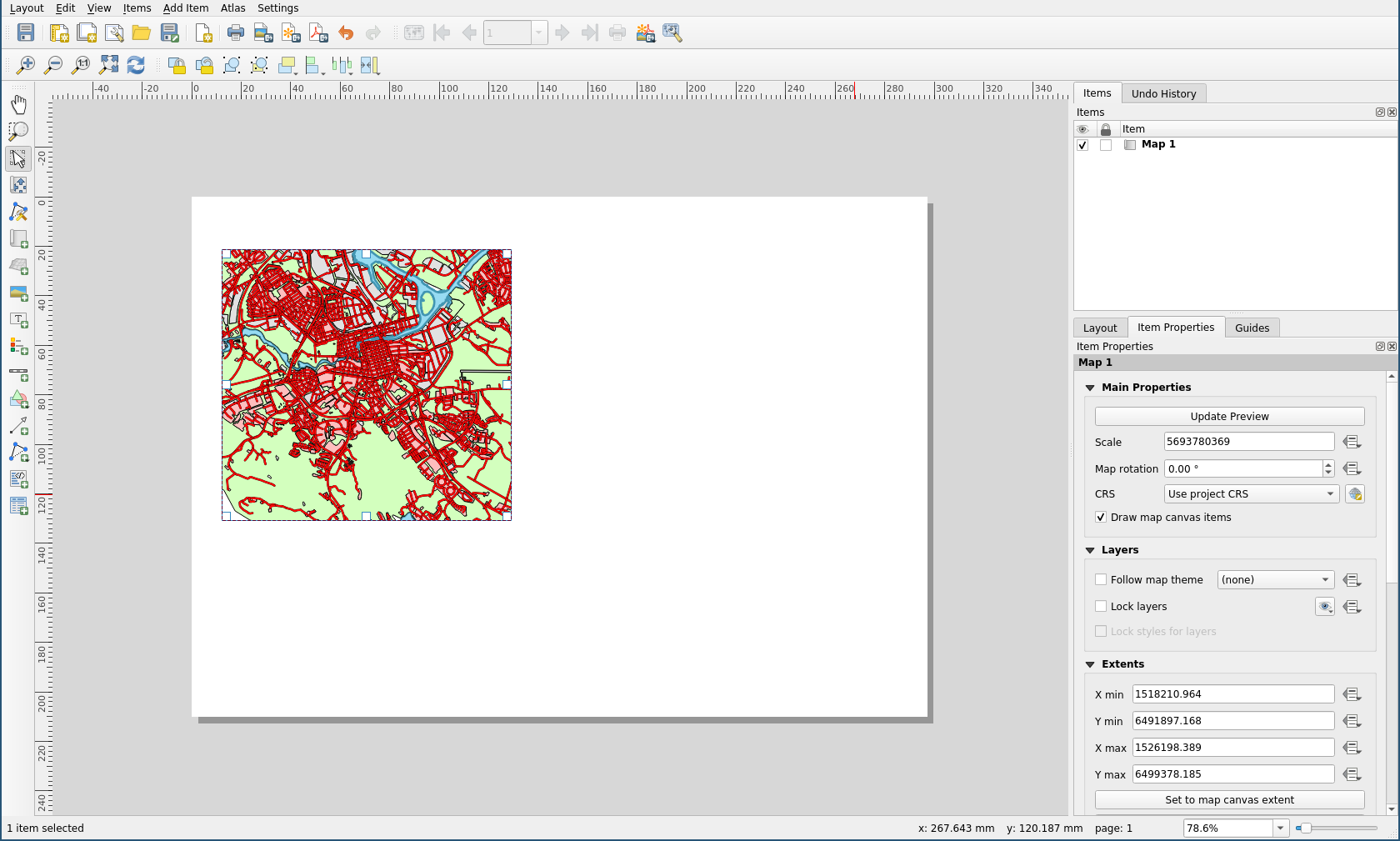
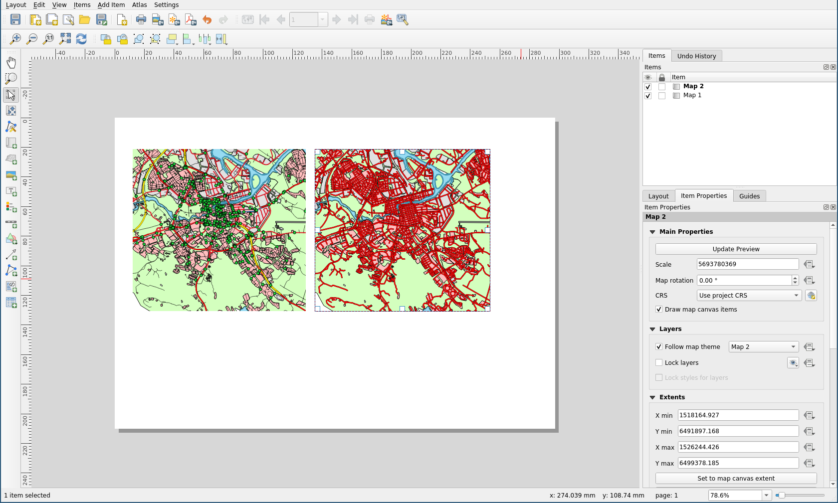
10. Force the first layer style on the map by selecting Map 1 in Follow map theme dropdown. You will see that the first theme was applied to the map.
11. Using the same sequence of actions, add the second map to the canvas and apply the second theme to it. Now, you will see both maps showing the same data in different styles.
Note
Map themes do not save everything. The exact description of what exactly map themes save you can find in the official documentation.
Tutorial 2: The Label Tool
Labels can be added to a map to show any information about an object. Any vector layer can have labels associated with it. These labels rely on the attribute data of a layer for their content.
Note
The Layer Properties dialog does have a Labels tab, which now offers the same functionality, but for this example we’ll use the Label tool, accessed via a toolbar button.
The goal for this lesson: To apply useful and good-looking labels to a layer.
Proceed with this tutorial using the map from this zip-archive. Do not worry if your map does not look exactly the same as the one in the pictures. If you are interested in how this map was created, you are welcome to look at this and this pages.
1.  Follow Along: Using Labels
Before being able to access the Label tool, you will need to ensure that it has been activated.
- Go to the menu item .
- Ensure that the Label item has a check mark next to it. If it doesn’t, click on the Label item, and it will be activated.
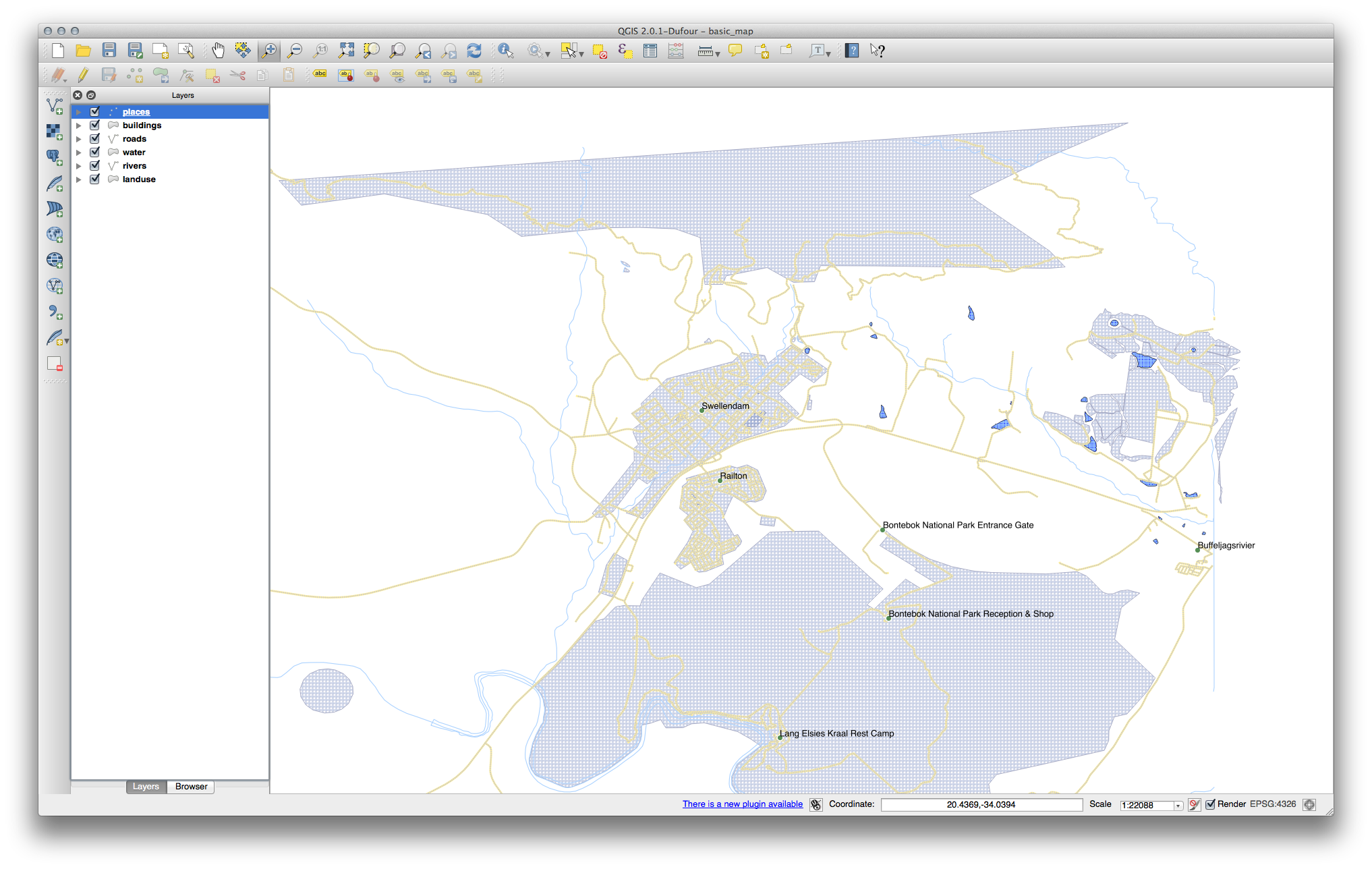
- Click on the places layer in the Layers panel, so that it is highlighted.
- Click on the following toolbar button:

This gives you the Layer labeling settings dialog.
- Check the box next to Label this layer with….
You’ll need to choose which field in the attributes will be used for the
labels. In the previous lesson, you decided that the NAME field was the
most suitable one for this purpose.
- Select name from the list:
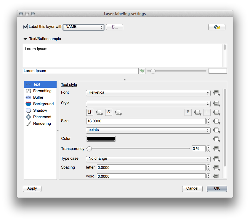
- Click OK.
The map should now have labels like this:
2. Follow Along: Changing Label Options
Depending on the styles you chose for your map in earlier lessons, you’ll might find that the labels are not appropriately formatted and either overlap or are too far away from their point markers.
- Open the Label tool again by clicking on its button as before.
- Make sure Text is selected in the left-hand options list, then update the text formatting options to match those shown here:
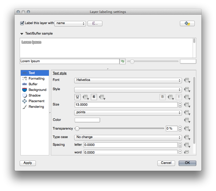
That’s the font problem solved! Now let’s look at the problem of the labels overlapping the points, but before we do that, let’s take a look at the Buffer option.
- Open the Label tool dialog.
- Select Buffer from the left-hand options list.
- Select the checkbox next to Draw text buffer, then choose options to match those shown here:
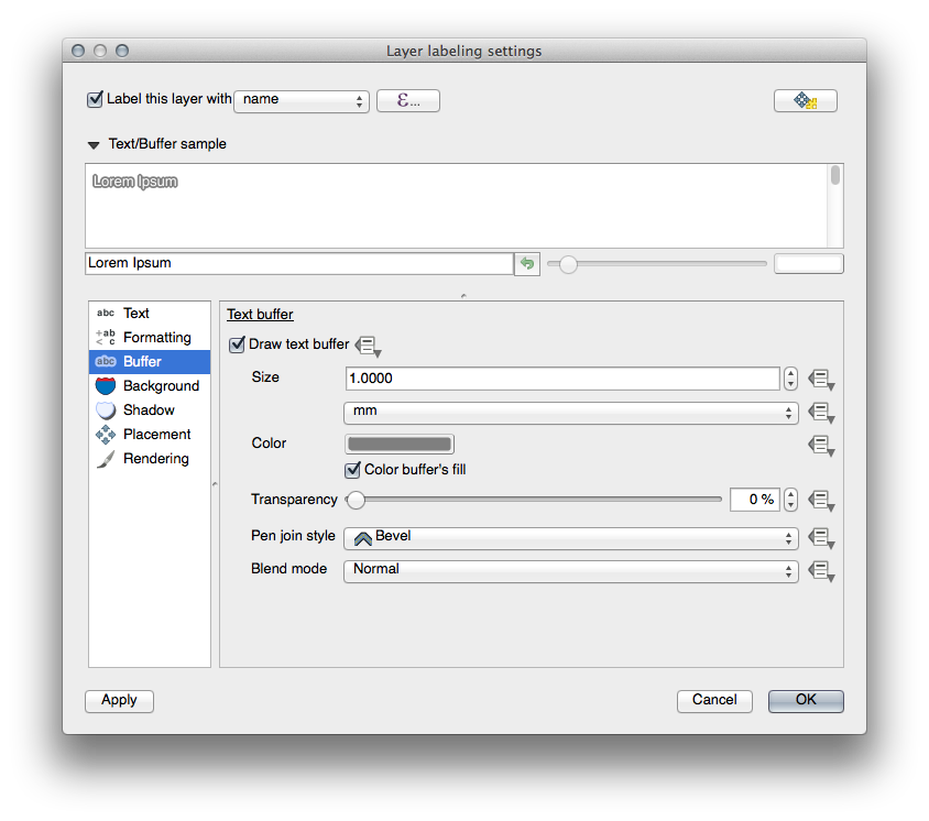
- Click Apply.
You’ll see that this adds a colored buffer or border to the place labels, making them easier to pick out on the map:
Now we can address the positioning of the labels in relation to their point markers.
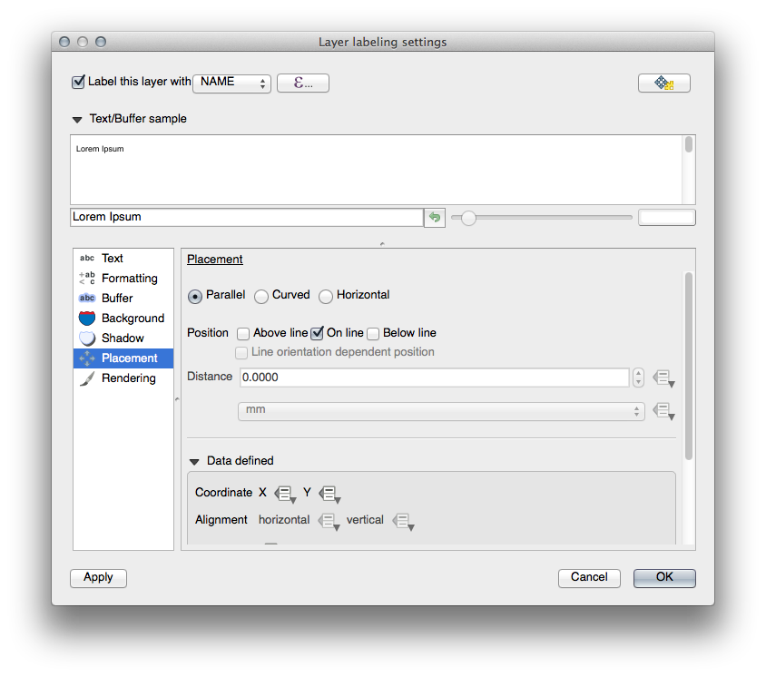
- In the Label tool dialog, go to the Placement tab.
- Change the value of Distance to
2mmand make sure that Around point is selected:
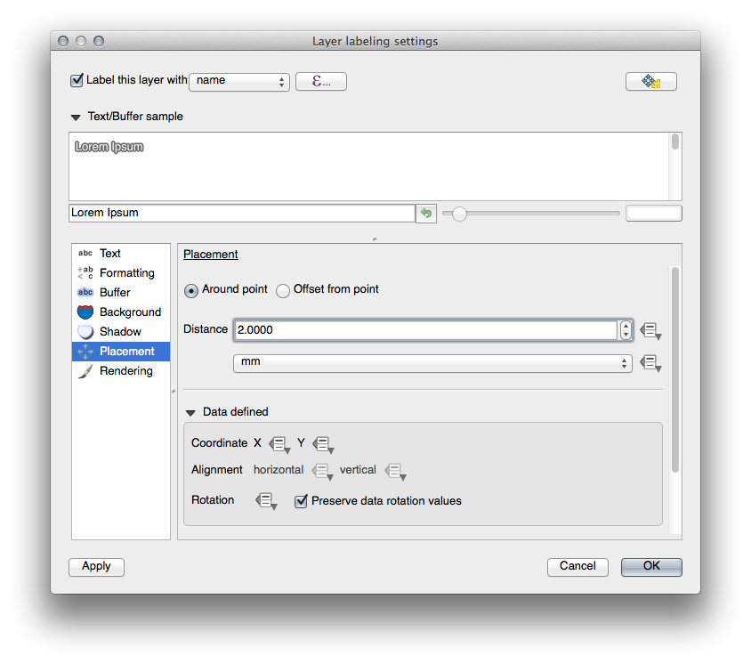
- Click Apply.
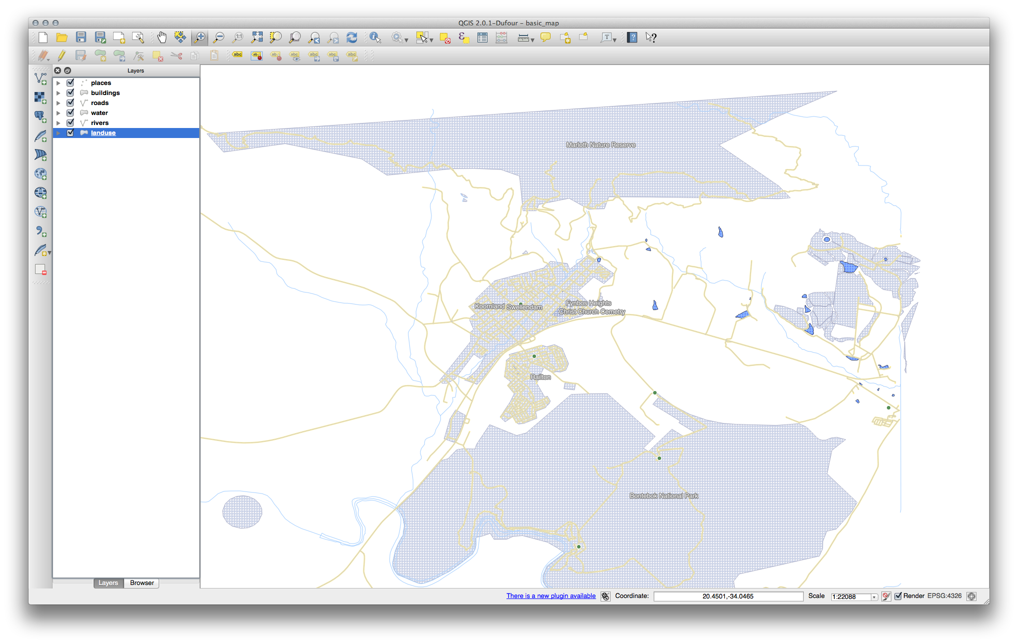
You’ll see that the labels are no longer overlapping their point markers.
3.  Follow Along: Using Labels Instead of Layer Symbology
In many cases, the location of a point doesn’t need to be very specific. For example, most of the points in the places layer refer to entire towns or suburbs, and the specific point associated with such features is not that specific on a large scale. In fact, giving a point that is too specific is often confusing for someone reading a map.
To name an example: on a map of the world, the point given for the European Union may be somewhere in Poland, for instance. To someone reading the map, seeing a point labeled European Union in Poland, it may seem that the capital of the European Union is therefore in Poland.
So, to prevent this kind of misunderstanding, it’s often useful to deactivate the point symbols and replace them completely with labels.
In QGIS, you can do this by changing the position of the labels to be rendered directly over the points they refer to.
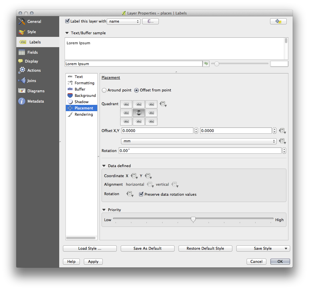
- Open the Layer labeling settings dialog for the places layer.
- Select the Placement option from the options list.
- Click on the Offset from point button.
This will reveal the Quadrant options which you can use to set the position of the label in relation to the point marker. In this case, we want the label to be centered on the point, so choose the center quadrant:
- Hide the point symbols by editing the layer style as usual, and setting the
size of the Ellipse marker width and height to
0:
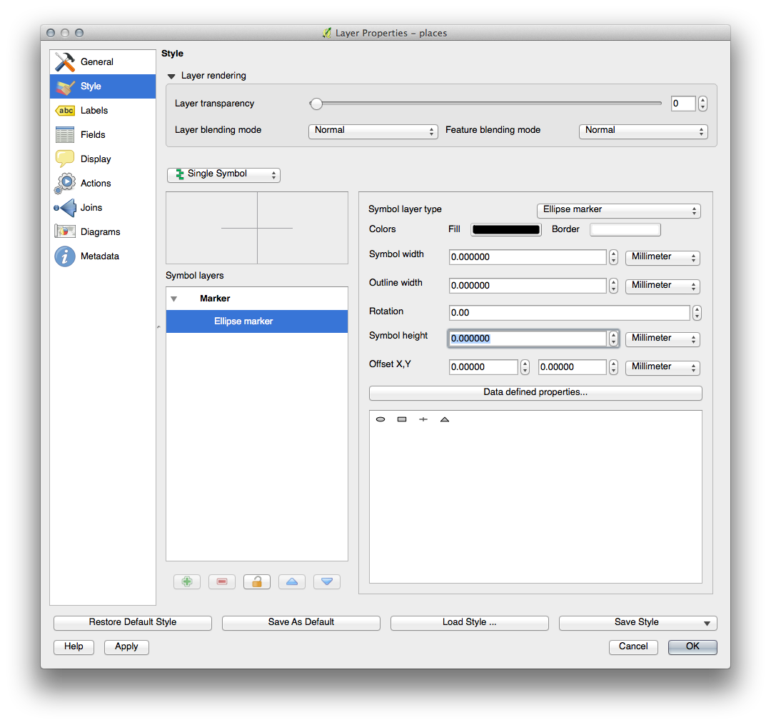
- Click OK and you’ll see this result:
If you were to zoom out on the map, you would see that some of the labels disappear at larger scales to avoid overlapping. Sometimes this is what you want when dealing with datasets that have many points, but at other times you will lose useful information this way. There is another possibility for handling cases like this, which we’ll cover in a later exercise in this lesson.
4. Try Yourself Customize the Labels
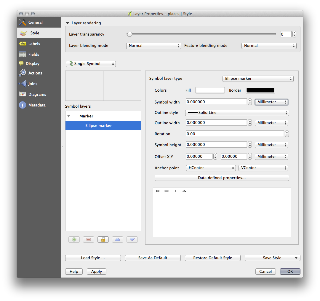
- Return the label and symbol settings to have a point marker and a label offset
of
2.00mm. You may like to adjust the styling of the point marker or labels at this stage.
- Set the map to the scale
1:100000. You can do this by typing it into the Scale box in the Status Bar. - Modify your labels to be suitable for viewing at this scale.
5. Follow Along: Labeling Lines
Now that you know how labeling works, there’s an additional problem. Points and polygons are easy to label, but what about lines? If you label them the same way as the points, your results would look like this:
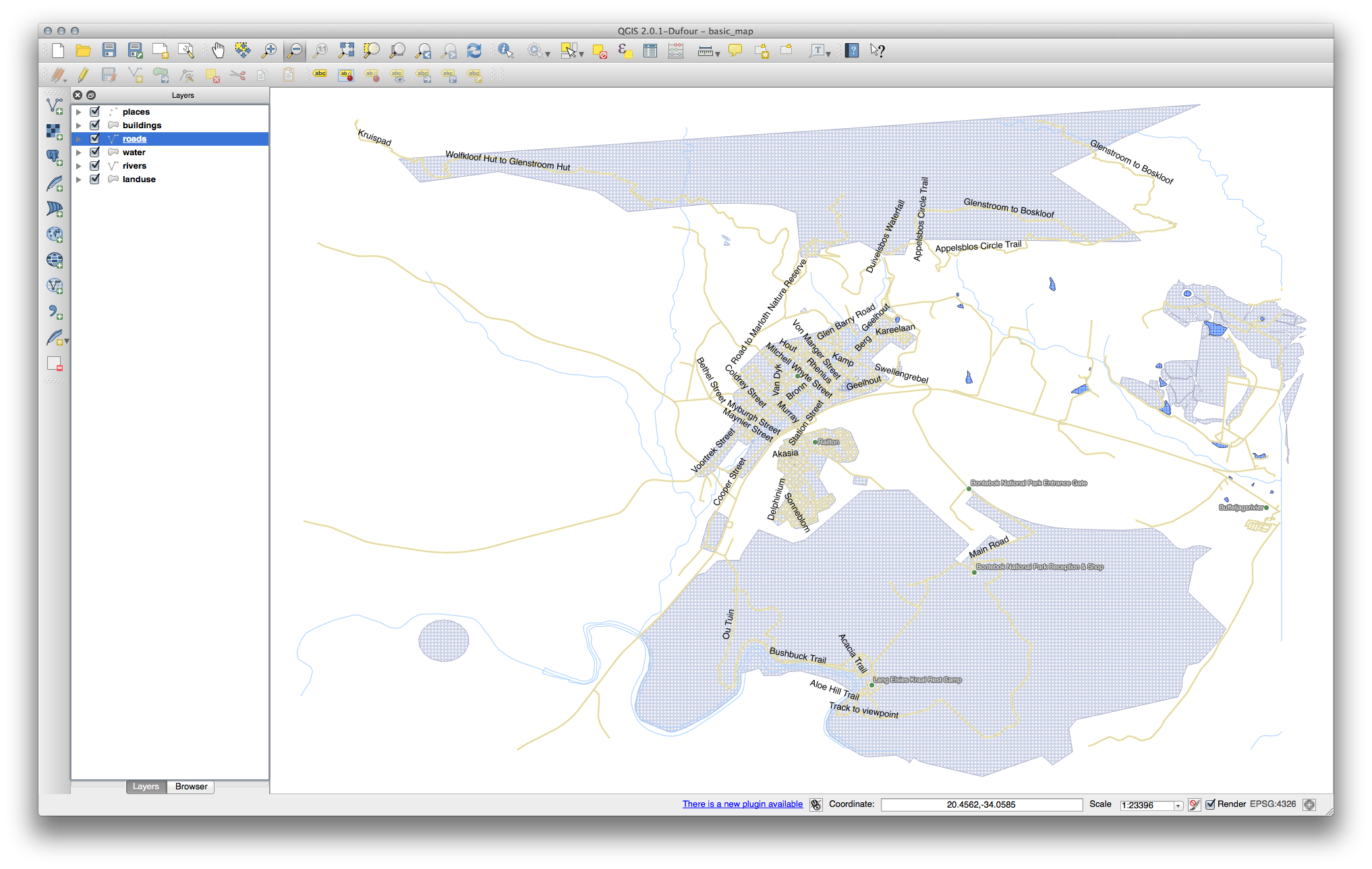
We will now reformat the roads layer labels so that they are easy to understand.
- Hide the Places layer so that it doesn’t distract you.
- Activate labels for the streets layer as before.
- Set the font Size to
10so that you can see more labels. - Zoom in on the Swellendam town area.
- In the Label tool dialog’s Advanced tab, choose the following settings:
You’ll probably find that the text styling has used default values and the
labels are consequently very hard to read. Set the label text format to have a
dark-grey or black Color and a light-yellow buffer.
The map will look somewhat like this, depending on scale:
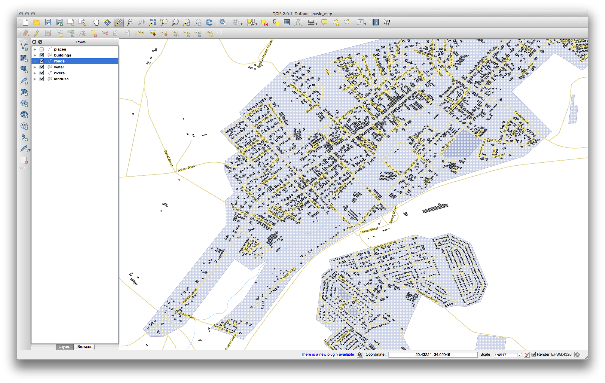
You’ll see that some of the road names appear more than once and that’s not always necessary. To prevent this from happening:
- In the Label labelling settings dialog, choose the Rendering option and select the Merge connected lines to avoid duplicate labels:
- Click OK
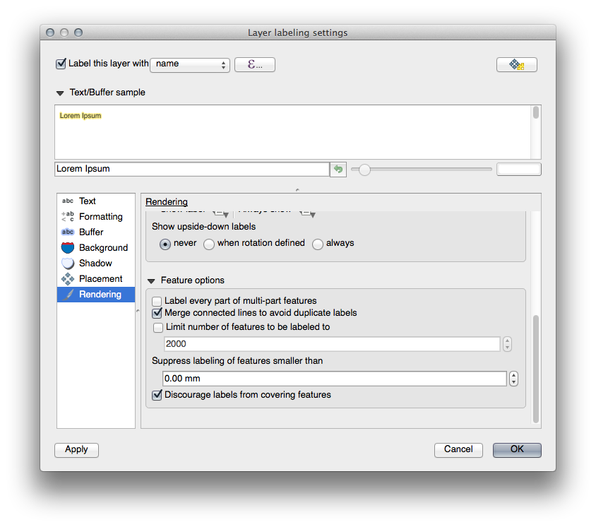
Another useful function is to prevent labels being drawn for features too short to be of notice.
- In the same Rendering panel, set the value of
Suppress labeling of features smaller than … to
5mmand note the results when you click Apply.
Try out different Placement settings as well. As we’ve seen before, the horizontal option is not a good idea in this case, so let’s try the curved option instead.
- Select the Curved option in the Placement panel of the Layer labeling settings dialog.
Here’s the result:
As you can see, this hides a lot of the labels that were previously visible, because of the difficulty of making some of them follow twisting street lines and still be legible. You can decide which of these options to use, depending on what you think seems more useful or what looks better.
6.  Follow Along: Data Defined Settings
- Deactivate labeling for the Streets layer.
- Reactivate labeling for the Places layer.
- Open the attribute table for Places via the
 button.

It has one fields which is of interest to us now: place which defines the
type of urban area for each object. We can use this data to influence the label
styles.
- Navigate to the Text panel in the places Labels panel.
- In the Italic dropdown, select
Edit...to open the Expression string builder:
In the text input, type: "place" = 'town' and click Ok
twice:
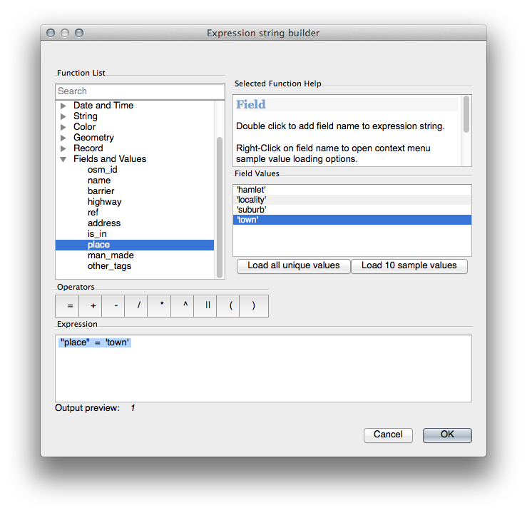
Notice its effects:
Note
Please do not forget to save the resulting map, because it will be used in the next tutorial!
7. Further Possibilities With Labeling
We can’t cover every option in this course, but be aware that the Label tool has many other useful functions. You can set scale-based rendering, alter the rendering priority for labels in a layer, and set every label option using layer attributes. You can even set the rotation, XY position, and other properties of a label (if you have attribute fields allocated for the purpose), then edit these properties using the tools adjacent to the main Label tool:


(These tools will be active if the required attribute fields exist and you are in edit mode.)
Feel free to explore more possibilities of the labeling system.
Tutorial 3: Vector classification
Labels are a good way to communicate information such as the names of individual places, but they can’t be used for everything. For example, let’s say that someone wants to know what each landuse area is used for. Using labels, you’d get this:
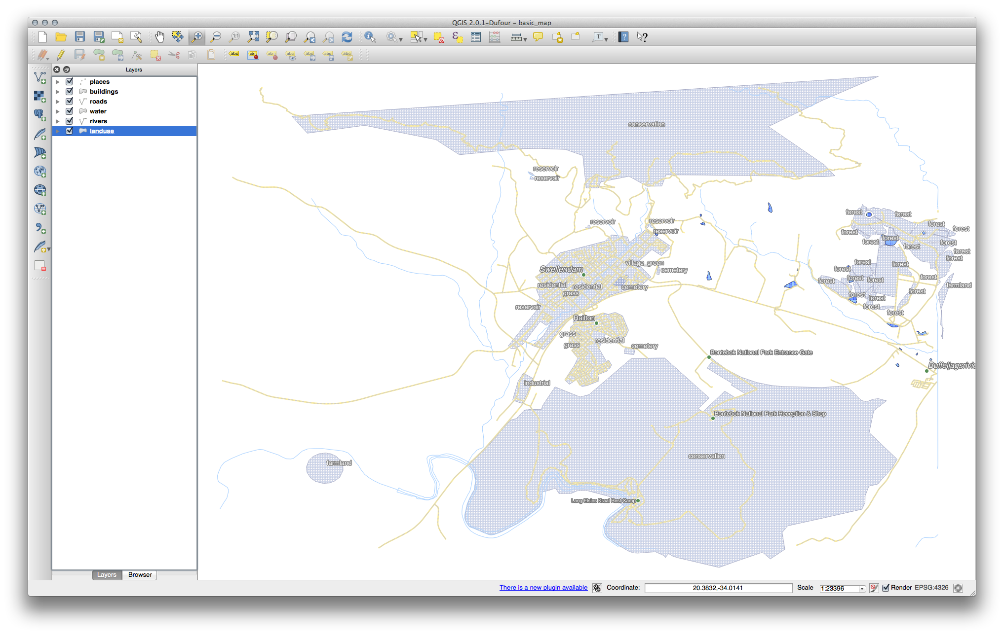
This makes the map’s labeling difficult to read and even overwhelming if there are numerous different landuse areas on the map.
The goal for this lesson: To learn how to classify vector data effectively.
Work with the map that you have obtained after completing Tutorial 2 in this lab.
1.  Follow Along: Classifying Nominal Data
- Open the Layer Properties dialog for the landuse layer.
- Go to the Symbology tab.
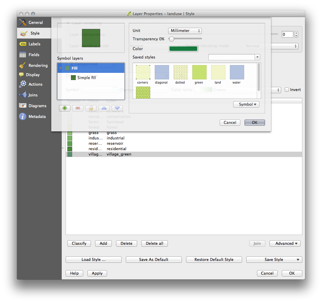
- Click on the dropdown that says Single Symbol and change it to Categorized:
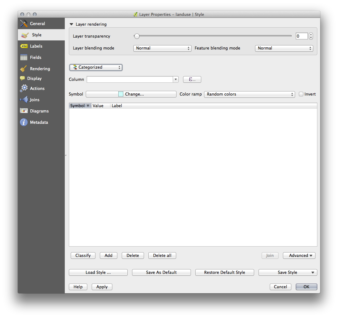
- In the new panel, change the Column to landuse and the Color ramp to Greens.
- Click the button labeled Classify:

- Click OK.
You’ll see something like this:
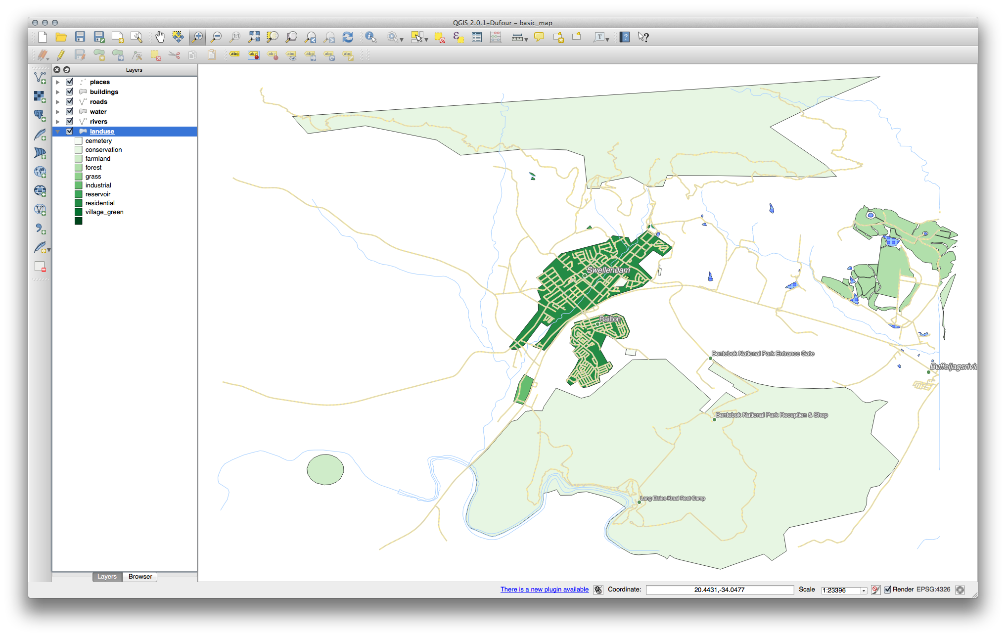
- Click the arrow (or plus sign) next to landuse in the Layer list, you’ll see the categories explained:
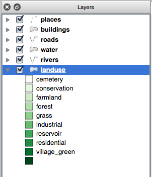
Now our landuse polygons are appropriately colored and are classified so that areas with the same land use are the same color. You may wish to remove the black border from the landuse layer:
- Open Layer Properties, go to the Symbology tab and select Symbol.
- Change the symbol by removing the border from the Simple Fill layer and click OK.
You’ll see that the landuse polygon outlines have been removed, leaving just our new fill colours for each categorisation.
- If you wish to, you can change the fill color for each landuse area by double-clicking the relevant color block:
Notice that there is one category that’s empty:
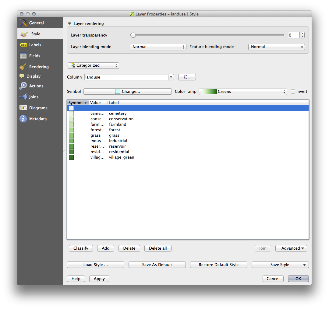
This empty category is used to color any objects which do not have a landuse value defined or which have a NULL value. It is important to keep this empty category so that areas with a NULL value are still represented on the map. You may like to change the color to more obviously represent a blank or NULL value.
Remember to save your map now so that you don’t lose all your hard-earned changes!
2. Try Yourself More Classification
If you’re only following the basic-level content, use the knowledge you gained above to classify the buildings layer. Set the categorisation against the building column and use the Spectral color ramp.
Note
Remember to zoom into an urban area to see the results.
3.  Follow Along: Ratio Classification
There are four types of classification: nominal, ordinal, interval and ratio.
In nominal classification, the categories that objects are classified into are name-based; they have no order. For example: town names, district codes, etc.
In ordinal classification, the categories are arranged in a certain order. For example, world cities are given a rank depending on their importance for world trade, travel, culture, etc.
In interval classification, the numbers are on a scale with positive, negative and zero values. For example: height above/below sea level, temperature above/below freezing (0 degrees Celsius), etc.
In ratio classification, the numbers are on a scale with only positive and zero values. For example: temperature above absolute zero (0 degrees Kelvin), distance from a point, the average amount of traffic on a given street per month, etc.
In the example above, we used nominal classification to assign each farm to the town that it is administered by. Now we will use ratio classification to classify the farms by area.
- Save your landuse symbology (if you want to keep it) by clicking on the Save Style … button in the Style drop-down menu.
We’re going to reclassify the layer, so existing classes will be lost if not saved.
- Close the Layer Properties dialog.
- Open the Attributes Table for the landuse layer.
We want to classify the landuse areas by size, but there’s a problem: they don’t have a size field, so we’ll have to make one.
- Enter edit mode by clicking this button:

- Add a new column with this button:

- Set up the dialog that appears, like this:
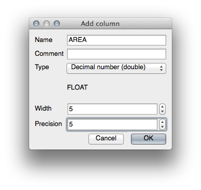
- Click OK.
The new field will be added (at the far right of the table; you may need to
scroll horizontally to see it). However, at the moment it is not populated, it
just has a lot of NULL values.
To solve this problem, we’ll need to calculate the areas.
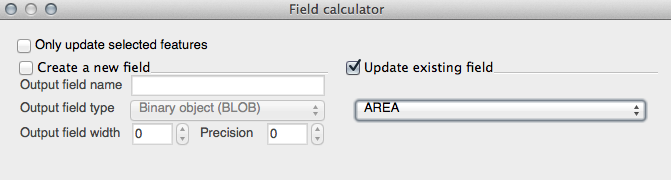
- Open the field calculator:

You’ll get this dialog:
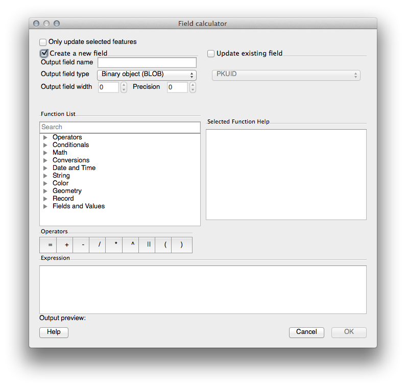
- Change the values at the top of the dialog to look like this:
- In the Function List, select :
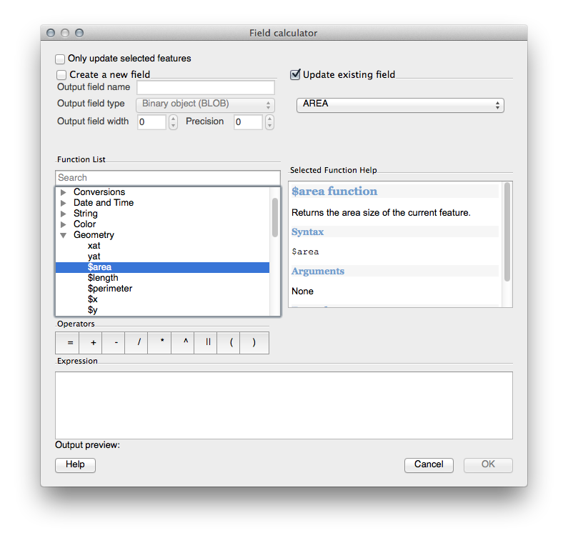
- Double-click on it so that it appears in the Expression field.
- Click OK.
Now your AREA field is populated with values (you may need to click the
column header to refresh the data). Save the edits and click Ok.
Note
These areas are in degrees. Later, we will compute them in square meters.
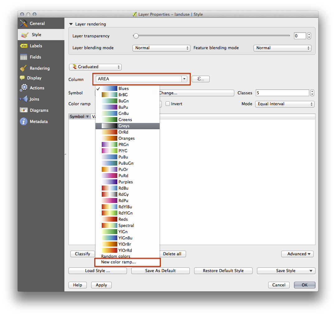
- Open the Layer properties dialog’s Symbology tab.
- Change the classification style from Categorized to Graduated.
- Change the Column to AREA:
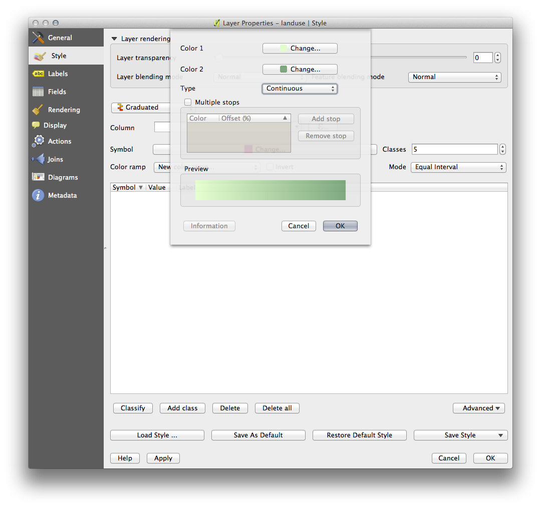
- Under Color ramp, choose the option New color ramp… to get this dialog:
- Choose Gradient (if it’s not selected already) and click OK. You’ll see this:
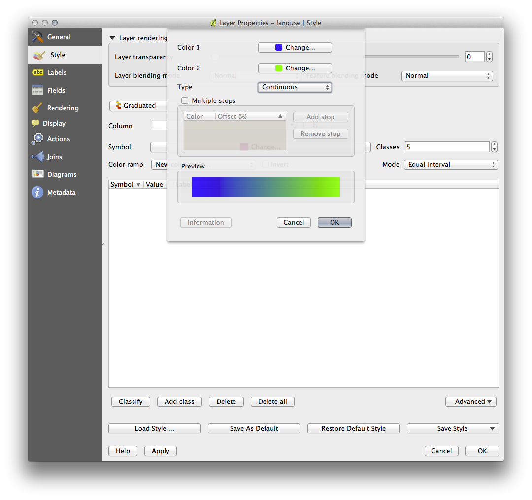
You’ll be using this to denote area, with small areas as Color 1 and large areas as Color 2.
- Choose appropriate colors.
In the example, the result looks like this:
- Click OK.
- Choose a suitable name for the new color ramp.
- Click OK after filling in the name.
Now you’ll have something like this:
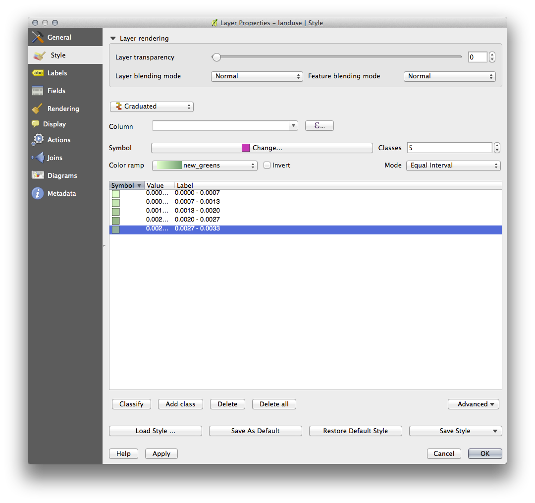
Leave everything else as-is.
- Click Ok:
4. Try Yourself Refine the Classification
- Get rid of the lines between the classes.
- Change the values of Mode and Classes until you get a classification that makes sense.
5.  Follow Along: Rule-based Classification
It’s often useful to combine multiple criteria for a classification, but unfortunately normal classification only takes one attribute into account. That’s where rule-based classification comes in handy.
- Open the Layer Properties dialog for the landuse layer.
- Switch to the Symbology tab.
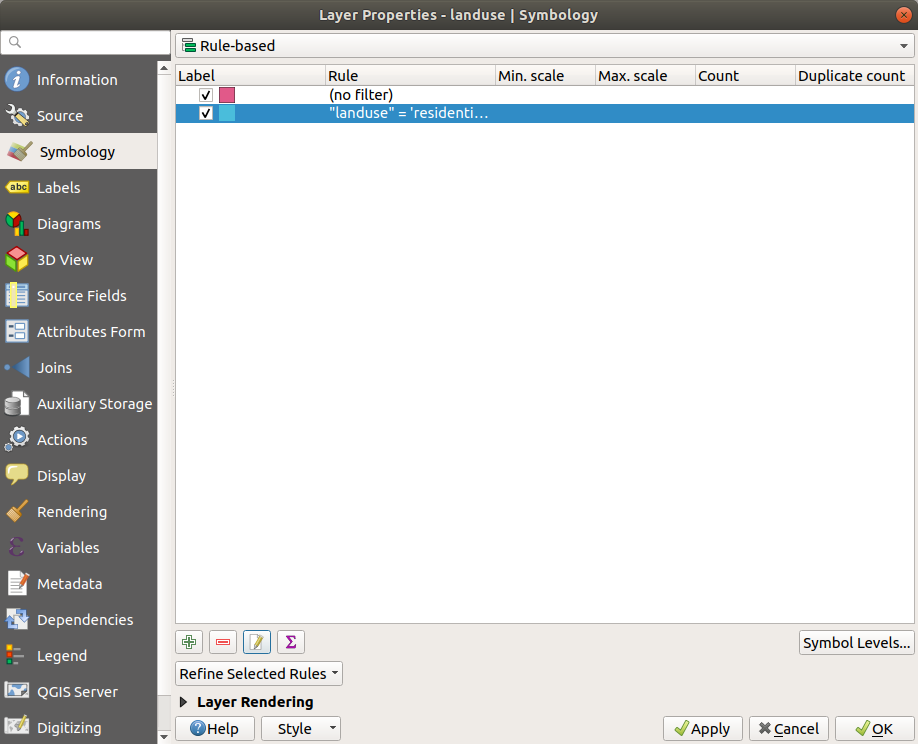
- Switch the classification style to Rule-based. You’ll get this:
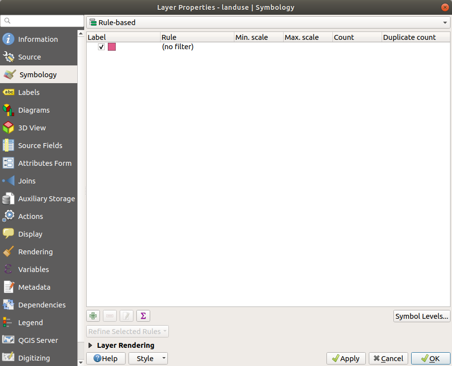
- Click the Add rule button:
 .
. - A new dialog then appears.
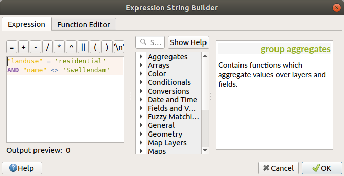
- Click the ellipsis … button next to the Filter text area.
- Using the query builder that appears, enter the criterion
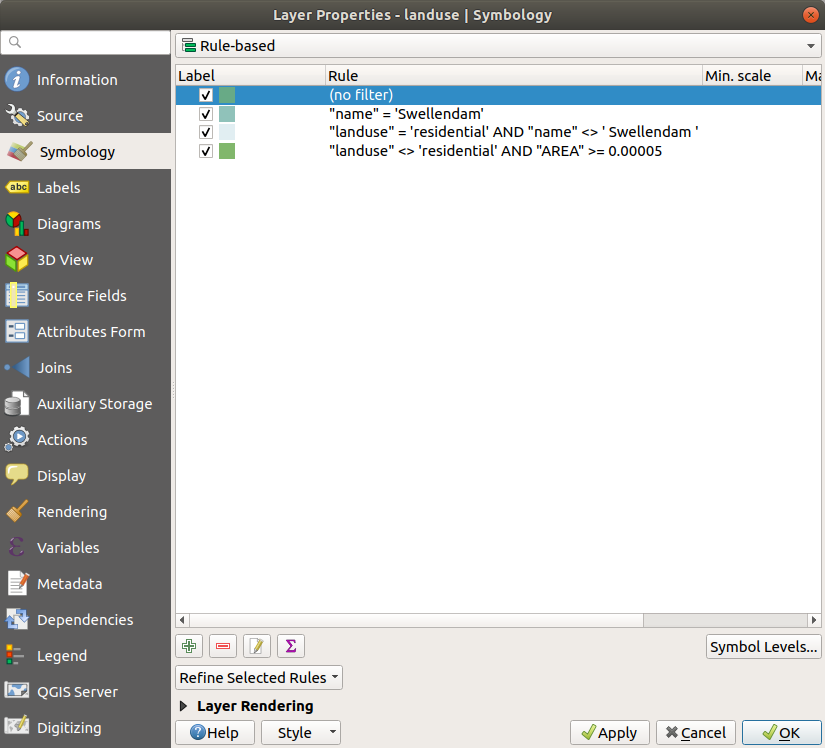
"landuse" = 'residential' AND "name" <> 'Swellendam'(or"landuse" = 'residential' AND "name" != 'Swellendam'), click Ok and choose a pale blue-grey for it and remove the border:

- Add a new criterion
"landuse" <> 'residential' AND "AREA" >= 0.00005and choose a mid-green color. - Add another new criterion
"name" = 'Swellendam'and assign it a darker grey-blue color in order to indicate the town’s importance in the region. - Click and drag this criterion to the top of the list.
These filters are exclusive, in that they collectively exclude some areas on the map (i.e. those which are smaller that 0.00005, are not residential and are not ‘Swellendam’). This means that the excluded polygons take the style of the default (no filter) category.
We know that the excluded polygons on our map cannot be residential areas, so give the default category a suitable pale green color.
Your dialog should now look like this:
- Apply this symbology.
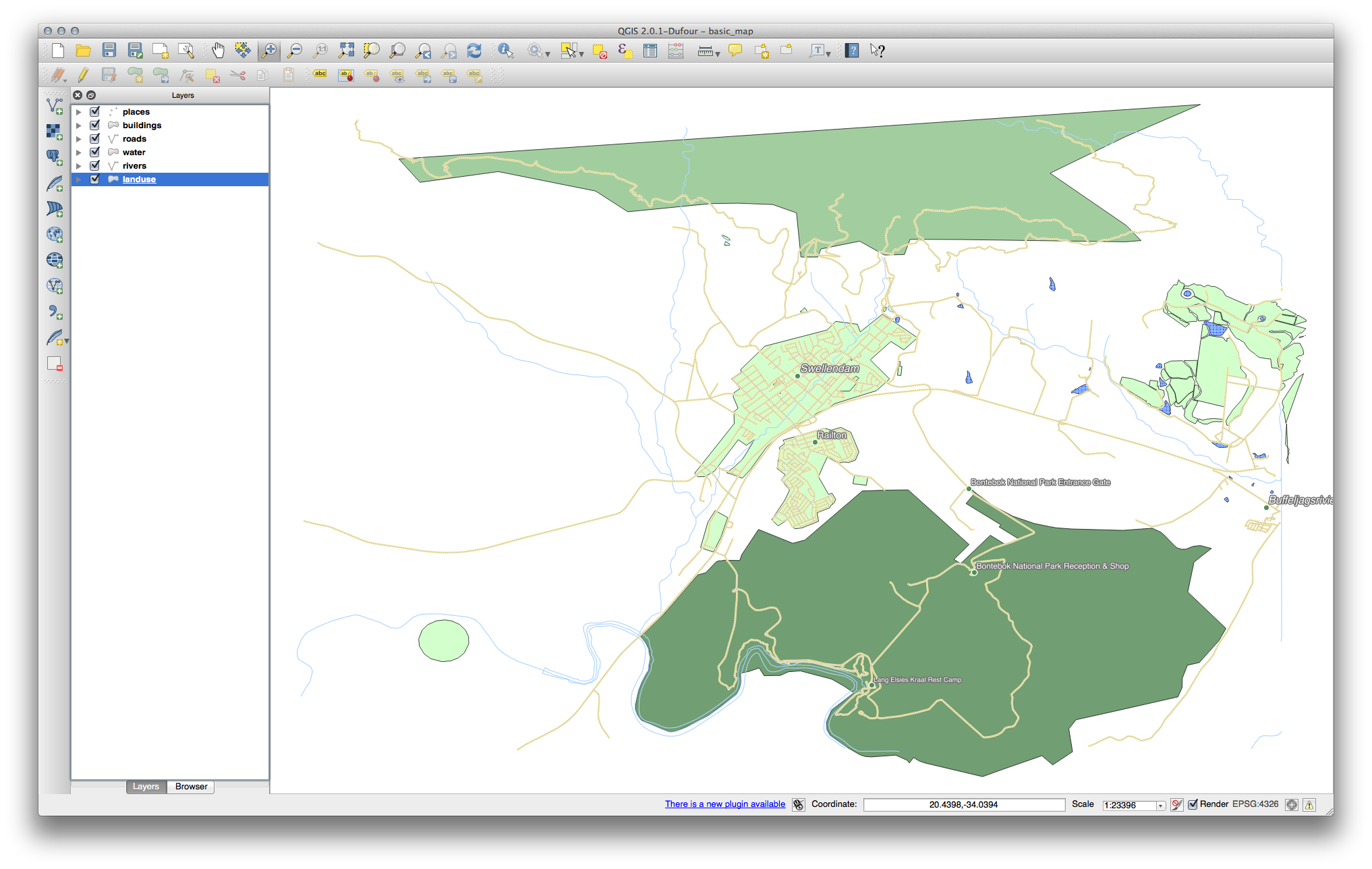
Your map will look something like this:
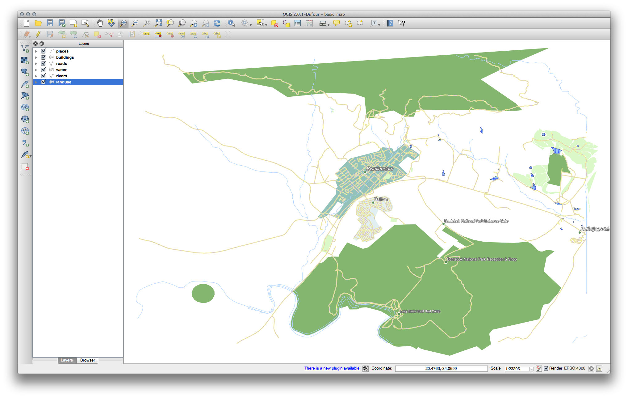
Now you have a map with Swellendam the most prominent residential area and other non-residential areas colored according to their size.
6. In Conclusion
Symbology allows us to represent the attributes of a layer in an easy-to-read way. It allows us as well as the map reader to understand the significance of features, using any relevant attributes that we choose. Depending on the problems you face, you’ll apply different classification techniques to solve them.
Tutorial 4: Calculating Line Lengths and Statistics (QGIS3)
QGIS has built-in functions and algorithms to calculate various properties based on the geometry of the feature - such as length, area, perimeter etc. This tutorial will show how to use the Add geometry attributess tool to add a column with a value representing length of each feature.
Overview of the task
Given a polyline layer of railroads in North America, we will determine the total length of railroads in the United States.
Other skills you will learn
- Using expressions to filter features.
- Using the Statistics panel to compute and view statistics on columns.
Get the data
Natural Earth has a public domain railroads dataset.
Download the North America supplement zip file from the portal.
For convenience, you may directly download a copy of the dataset from the link below:
ne_10m_railroads_north_america..zip
Data Source [NATURALEARTH]
Procedure
- Locate the downloaded
ne_10m_railroads_north_america.zipfile in the Browser panel and expand it. Drag thene_10m_railroads_north_america.shpfile to the canvas.
%20%E2%80%94%20QGIS%20Tutorials%20and%20Tips_files/120.png)
- You will see a new layer
ne_10m_railroads_north_americaloaded in the Layers panel. You will see that the layer has lines representing railroads for all of North America. Now, let’s calculate the lengths of each line feature. Go to .
%20%E2%80%94%20QGIS%20Tutorials%20and%20Tips_files/219.png)
- Search for and locate the algorithm. Double-click to launch it.
%20%E2%80%94%20QGIS%20Tutorials%20and%20Tips_files/316.png)
- In the Add Geometry Attributes dialog, select
ne_10m_railroads_north_americaas the Input layer. The input layer’s Coordinate Reference System (CRS) is EPSG:4326 WGS84. This is a Geographic CRS with Latitude and Longitude as coordinates, WGS84 as ellipsoid and degrees as units. Because latitude and longitude don’t have a standard length, you can’t measure distances or areas accurately using planar geometry functions. Fortunately, QGIS provides a better way to compute distances using ellipsoidal geometry, which is the most accurate method for layers spanning large areas such as this. PickEllipsoidalas the Calculate using option. Click Run. Once the process finishes, click Close.
%20%E2%80%94%20QGIS%20Tutorials%20and%20Tips_files/47.png)
Note
If your input layer is in a Projected CRS, you may choose Layer CRS
option for calculation. Local or Regional projected coordinate systems
are designed to minimize distortions over their region of interest, so
are more accurate for such computation.
- You will see a new layer
Added geom infoloaded in the Layers panel. This is a copy of the input layer with a new column added for distance. Right-click theAdded geom infolayer and select Open Attribute Table.
%20%E2%80%94%20QGIS%20Tutorials%20and%20Tips_files/57.png)
Note
The Add Geometry Attribute tool adds different set of attributes depending on whether the input layer is points, lines or polygons. See QGIS documentation for more details.
- In the Attribute Table, you will see a new column called distance. This contains the length of each line feature in meters. Also note that the sov_a3 attribute which contains the contry code for each feature. Close the Attribute Table window.
%20%E2%80%94%20QGIS%20Tutorials%20and%20Tips_files/67.png)
- Now that we have lengths of individual railroad line segments, we
can add them up to find the total length of railroads. But as the
problem statement demands we need total railroad length in the United
States, we must use only the segments contained within USA. We can use
the country code value in the sov_a3 column to filter the layer. Right-click the
Added geom infolayer and select Filter.
%20%E2%80%94%20QGIS%20Tutorials%20and%20Tips_files/77.png)
- In the Query Builder dialog, enter the following expression and click OK.
"sov_a3" = 'USA'%20%E2%80%94%20QGIS%20Tutorials%20and%20Tips_files/87.png)
- You will see a Filter icon appear next to the
Added geom infolayer in the Layers panel indicating that a filter is applied to the layer. You can also visually confirm that the layer now contains line segments only for United States. Now we are ready to calculate the sum. Click the Show statistical summary button on the Attributes Toolbar.
%20%E2%80%94%20QGIS%20Tutorials%20and%20Tips_files/97.png)
- A new Statistics panel will open. Select
Added geom infolayer andlengthcolumn.
%20%E2%80%94%20QGIS%20Tutorials%20and%20Tips_files/107.png)
- You will see various statistics displayed in the panel. The unit of the statistics is the same as the units of
lengthcolumn - meters. Let’s change the computation to use kilometers instead. Click the Expression icon next to the fields drop-down menu in the Statistics panel.
%20%E2%80%94%20QGIS%20Tutorials%20and%20Tips_files/1110.png)
- Enter the following expression in the Expression Dialog that converts the length to kilometers.
length / 1000%20%E2%80%94%20QGIS%20Tutorials%20and%20Tips_files/127.png)
- The Sum value displayed is the total length of railroads in USA.
%20%E2%80%94%20QGIS%20Tutorials%20and%20Tips_files/137.png)
Assignment
Start by opening a new document and add the three .shp layers from this zip-archive to the view. Chose blue colour for the hydrography and pink for the city polygons. The road net comes from the Swedish National Road Administration which manages a road data base. It stores the geometry of all roads and streets together with a lot of attributes about the road conditions. This is a subsection of the road data base that covers Kristianstad commune. The flow of traffic has been measured and stored in the table connected to the layer.
The task is to visualize the traffic in two maps. The first map shall show different road classes together with the layers hydrography and city limits. You can find this information in the database layer in a field called VAEGKAT. Chose symbols according to your own ideas and label the roads with their numbers. The World Street Map should not be visible in any of the two maps.
Tip
Read https://docs.qgis.org/3.4/en/docs/user_manual/working_with_vector/vector_properties.html#symbology-properties if you want to learn options for symbology rendering which are not covered in the tutorials.
The second map shall show the traffic intensity as graduated symbols together with hydrography and city limits. The problem is to chose a classification scheme and number of classes that makes the map easy to understand. The road segments shall also be labelled with relevant figures about traffic intensity. You can chose any of the following fields to visualize.
Number of vehicles per day (ADTFORDON)
Number of trucks per day (ADTLASTBIL)
Show the result of your classifications on a layout with two map windows, one for each map. The maps should have the same scale (1:250 000 or select an appropriate one) and the same centre (city centre). Other information on the layout shall be a legend, a north arrow, scale text and your name. A report following the template must accompany the map. In the result section of the report you should give a short motivation for your choice of classification scheme and number of classes.
Tutorials 2 and 3 are edited by me tutorials from https://docs.qgis.org and are shared here in accordance with CC BY-SA 3.0 license under the same license. Thank you, QGIS!
Tutorial 4 is a courtesy of QGIS tutorial by Ujaval Gandhi and is shared here in accordance with CC-BY 4.0 license under the same license. Thank you, Ujaval Gandhi!