Tutorial 1: Making a Map (QGIS3)
Often one needs to create a map that can be printed or published. QGIS has a powerful tool called Print Layout that allows you to take your GIS layers and package them to create maps.
Overview of the task
The tutorial shows how to create a map of Japan with standard map elements like map inset, grids, north arrow, scale bar and labels.
Other skills you will learn
- How to view and change QGIS Project Variables
- How to use QGIS expressions
Get the data
We will use the Natural Earth dataset - specifically the Natural Earth Quick Start Kit that comes with beautifully styled global layers that can be loaded directly to QGIS.
Download the Natural Earth Quickstart Kit.
Data Source [NATURALEARTH]
Procedure
- Download and extract the Natural Earth Quick Start Kit data. Open QGIS. Locate the
Natural Earth quick startfolder in the Browser panel. Expand the folder to locate theNatural_Earth_quick_start_for_QGIS_v3project. This is the project file that contains styled layers in QGIS Document format. Double-click the project to open it.
%20%E2%80%94%20QGIS%20Tutorials%20and%20Tips_files/169.png)
- You may notice that the map has labels in Greek. This project uses variables to set the language. We can change the variables by going to .
%20%E2%80%94%20QGIS%20Tutorials%20and%20Tips_files/236.png)
Note
Project variables are a great way to store project-specific values for use anywhere you can use an expression in QGIS. The Natural_Earth_quick_start_for_QGIS_v3 project comes with many preset variables that are used for styling within that project.
- Switch to the Variables tab in the Project Properties dialog. Locate the
project_languagevariable and click on the Value column to edit it. Change the language toname_enand click OK.
%20%E2%80%94%20QGIS%20Tutorials%20and%20Tips_files/326.png)
- Back in the main QGIS window, click the Refresh button in the Map Navigation Toolbar. You will now see the map rendered with English labels.
%20%E2%80%94%20QGIS%20Tutorials%20and%20Tips_files/413.png)
- Use the pan and zoom controls in the Map Navigation Toolbar and to zoom to Japan.
%20%E2%80%94%20QGIS%20Tutorials%20and%20Tips_files/513.png)
- You can turn off some map layers for data that we do not need for this map. Expand the
z5 - 1:18mfolder and uncheck the box next tone_10m_geography_marine_polysandne_10m_admin_0_disputed_areaslayers. Before we make a map suitable for printing, we need to choose an appropriate projection. The default CRS for the project is set toEPSG:3857 Pseudo-Mercator. This is a CRS popularly used for web mapping and is a decent choice for our purpose, so we can leave it to its defalt value. Go to .
%20%E2%80%94%20QGIS%20Tutorials%20and%20Tips_files/613.png)
Note
For Japan, Japan Plane Rectangular CS is a projected coordinate reference system (CRS) that is designed for minimum distortions. It is divided in 18 zones and if you are working for a smaller region in Japan, using this CRS will be better.
- You will be prompted to enter a title for the layout. You can leave it empty and click Ok.
%20%E2%80%94%20QGIS%20Tutorials%20and%20Tips_files/712.png)
Note
Leaving the layout name empty will assign a default name such as
Layout 1.
- In the Print Layout window, click on Zoom full button to display the full extent of the Layout.
%20%E2%80%94%20QGIS%20Tutorials%20and%20Tips_files/812.png)
- Now we would have to bring the map view that we see in the QGIS Canvas to the layout. Go to .
%20%E2%80%94%20QGIS%20Tutorials%20and%20Tips_files/912.png)
- Once the Add Map mode is active, hold the left mouse button and drag a rectangle where you want to insert the map.
%20%E2%80%94%20QGIS%20Tutorials%20and%20Tips_files/1012.png)
- You will see that the rectangle window will be rendered with the map from the main QGIS canvas. The rendered map may not be covering the full extent of our interest area. Use and options to pan the map in the window and center it in the composer.
%20%E2%80%94%20QGIS%20Tutorials%20and%20Tips_files/1115.png)
- Let us also adjust the zoom level for the map. Click on the Item Properties tab and enter
10000000as the Scale value.
%20%E2%80%94%20QGIS%20Tutorials%20and%20Tips_files/1213.png)
- Now we will add a map inset that shows a zoomed in view for the Tokyo area. Before we make any changes to the layers in the main QGIS window, check the Lock layers and Lock styles for layers boxes. This will ensure that if we turn off some layers or change their styles, this view will not change.
%20%E2%80%94%20QGIS%20Tutorials%20and%20Tips_files/1313.png)
- Switch to the main QGIS window. Turn off the layer group
z5 - 1:18mand activate thez7 - 1: 4mgroup. This layer group has styling that is more appropriate for a zoomed-in view. Use the pan and zoom controls in the Map Navigation Toolbar and to zoom around Tokyo.
%20%E2%80%94%20QGIS%20Tutorials%20and%20Tips_files/1411.png)
- We are now ready to add the map inset. Switch the the Print Layout window. Go to .
%20%E2%80%94%20QGIS%20Tutorials%20and%20Tips_files/1510.png)
- Drag a rectangle at the place where you want to add the map inset. You will now notice that we have 2 map objects in the Print Layout. When making changes, make sure you have the correct map selected.
%20%E2%80%94%20QGIS%20Tutorials%20and%20Tips_files/1610.png)
- Select the
Map 2object that we just added from the Items panel. Select the Item properties tab. Scroll down to the Frame panel and check the box next to it. You can change the color and thickness of the frame border so it is easy to distinguish against the map background.
%20%E2%80%94%20QGIS%20Tutorials%20and%20Tips_files/1710.png)
- One neat feature of the Print Layout is that it can automatically
highlight the area from the main map which is represented in the inset.
Select the
Map 1object from the Items panel. In the Item properties tab, scroll down to the Overviews section. Click the Add a new overview button.
%20%E2%80%94%20QGIS%20Tutorials%20and%20Tips_files/189.png)
- Select
Map 2as the Map Frame. This tells the Print Layout to highlight the current objectMap 1with the extent of the map shown in theMap 2object.
%20%E2%80%94%20QGIS%20Tutorials%20and%20Tips_files/198.png)
- Now that we have the map inset ready, we will add a grid to the main map. Select the
Map 1object from the Items panel. In the Item properties tab, scroll down to the Grids section. Click the Add a new grid button, followed by Modify grid....
%20%E2%80%94%20QGIS%20Tutorials%20and%20Tips_files/207.png)
- By default, the grid lines use the same units and projections as the currently selected map projections. However, it is more common and useful to display grid lines in degrees. We can select a different CRS for the grid. Click on the Change... button next to CRS.
%20%E2%80%94%20QGIS%20Tutorials%20and%20Tips_files/2112.png)
- In the Coordinate Reference System Selector dialog, enter
4326in the Filter box. From the results, select theWGS84 EPSG:4326as the CRS. Click OK.
%20%E2%80%94%20QGIS%20Tutorials%20and%20Tips_files/2210.png)
- Select the Interval values as
5degrees in both X and Y direction. You can adjust the Offset to change where the grid lines appear.
%20%E2%80%94%20QGIS%20Tutorials%20and%20Tips_files/237.png)
- Scroll down to the Grid frame section and check the Draw coordinates box. The default format is
Degreesbut it appears as a number. We can customize is to append a ° symbol. ChooseCustomand click the Expression button next to it.
%20%E2%80%94%20QGIS%20Tutorials%20and%20Tips_files/245.png)
- Enter the following expression to create a string that takes the grid number and appends ° symbol to it.
concat(to_string(@grid_number), '° ')%20%E2%80%94%20QGIS%20Tutorials%20and%20Tips_files/254.png)
- Notice that the grids now have a custom label from the expression. Adjust the position settings for Left, Right, Top and Bottom as per your liking.
%20%E2%80%94%20QGIS%20Tutorials%20and%20Tips_files/264.png)
- Now we will add a Rectangluar frame to hold other map elements like north arrow, scale and label. Go to .
%20%E2%80%94%20QGIS%20Tutorials%20and%20Tips_files/274.png)
- You can change the Style of the rectangle to match the map background.
%20%E2%80%94%20QGIS%20Tutorials%20and%20Tips_files/284.png)
- Now we will add a North Arrow to the map. QGIS comes with a nice collection of map-related images - including many types of North Arrows. Click .
%20%E2%80%94%20QGIS%20Tutorials%20and%20Tips_files/293.png)
- Holding your left mouse button, draw a rectangle. On the right-hand panel, click on the Item Properties tab and expand the Search directories section and select the image of your liking.
%20%E2%80%94%20QGIS%20Tutorials%20and%20Tips_files/303.png)
- Now we will add a scale bar. Click on .
%20%E2%80%94%20QGIS%20Tutorials%20and%20Tips_files/3110.png)
- Click on the layout where you want the scalebar to appear. In the Item Properties tab, make sure you have chosen the correct map element
Map 1for which to display the scalebar. Choose the Style that fit your requirement. In the Segments panel, change the Fixed width to200units and adjust the segments to your liking.
%20%E2%80%94%20QGIS%20Tutorials%20and%20Tips_files/327.png)
- It is time to label our map. Click on .
%20%E2%80%94%20QGIS%20Tutorials%20and%20Tips_files/331.png)
- Click on the map and draw a box where the label should be. In the Item Properties tab, expand the Label section and enter a label for the map. Similarly add another labels for data and software credits.
%20%E2%80%94%20QGIS%20Tutorials%20and%20Tips_files/341.png)
- Once you are satisfied with the map, you can export it as an Image, PDF or SVG. For this tutorial, let’s export it as an image. Click .
%20%E2%80%94%20QGIS%20Tutorials%20and%20Tips_files/351.png)
- Save the image in the format of your liking. Below is the exported PNG image.
%20%E2%80%94%20QGIS%20Tutorials%20and%20Tips_files/output.png)
Tutorial 2: Working with Attributes
GIS data has two parts - features and attributes. Attributes are structured data about each feature. This tutorial shows how to view the attributes of a GIS vector layer and do basic queries on them in QGIS.
Overview of the task
The dataset for this tutorial contains information about populated places of the world. The task is to query and find all the capital cities in the world that have a population greater than 1 million and save the resulting subset as a GeoJSON file.
Other skills you will learn
- Select features from a layer using expressions.
- Using the Attributes toolbar.
- Exporting selected features in a layer
Get the data
Natural Earth provides a Populated Places dataset. Download the simple (less columns) dataset
For convenience, you may directly download a copy of datasets from the link below:
ne_10m_populated_places_simple.zip
Data Source [NATURALEARTH]
Procedure
- Locate the
ne_10m_populated_places_simple.zipfile in the QGIS Browser and expand it. Select thene_10m_populated_places_simple.shpfile and drag it to the canvas.
%20%E2%80%94%20QGIS%20Tutorials%20and%20Tips_files/1130.png)
- A new layer
ne_10m_populated_places_simplewill now be loaded in QGIS and you will see many points representing the populated places of the world. The default view in the QGIS canvas shows the geometry of the GIS layer. Each point also has associated attributes. Let’s view them. Locate the Attributes Toolbar. This toolbar contains many useful tools to inspect, view, select, and modify attributes of a layer.
%20%E2%80%94%20QGIS%20Tutorials%20and%20Tips_files/280.png)
Note
If you do not see the toolbar, you can enable it from
- Click the Identify button on the Attributes Toolbar. Once the tool is selected, click on any point on the canvas. The associated attributes of that point will be displayed in a new Identify Results panel. Once you are done exploring attributes of different points, you can click the Close button.
%20%E2%80%94%20QGIS%20Tutorials%20and%20Tips_files/344.png)
- Rather than viewing the attribute one feature at a time, we can view them all together as a table. Click the Open Attribute Table button on the Attributes Toolbar. You can also right-click the
ne_10m_populated_places_simplelayer and select Open Attribute Table.
%20%E2%80%94%20QGIS%20Tutorials%20and%20Tips_files/428.png)
- You can scroll horizontally and locate the pop_max column. This field contains the population of the associated place. You can click twice on the field header to sort the column in descending order.
%20%E2%80%94%20QGIS%20Tutorials%20and%20Tips_files/528.png)
- Now we are ready to perform our query on these attributes. QGIS uses SQL-like expressions to perform queries. Click Select features using an expression button.
%20%E2%80%94%20QGIS%20Tutorials%20and%20Tips_files/627.png)
- In the Select By Expression window, expand the Fields and Values section and double-click the
pop_maxlabel. You will notice that it is added to the expression section at the bottom. If you aren’t sure about the field values, you can click the All Unique button to see what the attribute values are present in the dataset. For this exercise, we are looking to find all features that have a population greater than 1 million. So complete the expression as below and click Select Features and then Close.
"pop_max" > 1000000%20%E2%80%94%20QGIS%20Tutorials%20and%20Tips_files/727.png)
Note
In the QGIS Expression engine, text with double-quotes refers to a field and text with single-quotes refer to a string value.
- You will notice that some rows in the attribute table are now selected. The label window also changes and shows the count of selected features.
%20%E2%80%94%20QGIS%20Tutorials%20and%20Tips_files/826.png)
- Close the attribute table window and return to the main QGIS window.
You will notice that a subset of points is now rendered in yellow. This
is the result of our query and the selected points are the ones having
pop_maxattribute value greater than1000000.
%20%E2%80%94%20QGIS%20Tutorials%20and%20Tips_files/927.png)
- Let’s update our query to include a condition that the place should also be a capital in addition to having a population greater than 1 million. To quickly get to the expression editor, you can use the Select Features by Expression button in the Attributes Toolbar.
%20%E2%80%94%20QGIS%20Tutorials%20and%20Tips_files/1025.png)
- The field containing data about capitals is adm0cap. The value
1indicates that the place is a capital. We can add this criteria to our previous expression using the and operator. Enter the expression as below and click Select features and then Close.
"pop_max" > 1000000 and "adm0cap" = 1%20%E2%80%94%20QGIS%20Tutorials%20and%20Tips_files/1131.png)
- Return to the main QGIS window. Now you will see a smaller subset of the points selected. This is the result of the second query and shows all places from the dataset that are country capitals as well as have population greater than 1 million.
%20%E2%80%94%20QGIS%20Tutorials%20and%20Tips_files/1227.png)
- Now we will export the selected features as a new layer. Right-click the
ne_10m_populated_places_simplelayer and go to
%20%E2%80%94%20QGIS%20Tutorials%20and%20Tips_files/1327.png)
- You may choose any format of your liking as the Format. For this exercise, we will choose
GeoJSON. GeoJSON is a text-based format that is used widely in web mapping. Click the ... button next to File name and enterpopulated_capitals.geojsonas the output file.
%20%E2%80%94%20QGIS%20Tutorials%20and%20Tips_files/1425.png)
- The input data has many columns. You are able to choose only a subset of the original columns for export. Expand the Select fields to export and their export options section. Click Deselect All and check the
nameandpop_maxcolumns. Click OK.
%20%E2%80%94%20QGIS%20Tutorials%20and%20Tips_files/1524.png)
- A new layer
populated_capitalswill be loaded in QGIS. You can un-check thene_10m_populated_places_simplelayer to hide it and view the points from the newly exported layer.
%20%E2%80%94%20QGIS%20Tutorials%20and%20Tips_files/1622.png)
Tutorial 3: Basic Vector Styling (QGIS3)
To create a map, one has to style the GIS data and present it in a form that is visually informative. There are a large number of options available in QGIS to apply different types of symbology to the underlying data. In this tutorial, we will take a text file and apply different data visualization techniques to highlight spatial patterns in the data.
Overview of the task
We will take a CSV file containing the location of all power plants in the world and create a visualization showing distribution of renewable and non-renewable fuels used in these power plants.
Other skills you will learn
- Use expressions to group multiple attribute values into a single category
Get the data
World Resources Institute has compiled a comprehensive, open source database of power plants around the world covering over 30000 plants. Download the The Global Power Plant Database from the WRI Open Data Portal.
Natural Earth has several global vector layers. Download the 10m Physical Vectors - Land containing Land polygons.
For convenience, you may directly download a copy of the above layers from below:
globalpowerplantdatabasev120.zip
Data Source [WRI] [NATURALEARTH]
Procedure
- Unzip both the datasets to a folder on your computer. In the QGIS
Browser Panel, locate the directory where you extracted the data. Expand
the
ne_10m_landfolder and select thene_10m_land.shplayer. Drag the layer to the canvas.
%20%E2%80%94%20QGIS%20Tutorials%20and%20Tips_files/114.png)
- You will a new layer
ne_10m_landadded to the Layers panel. The global power plant database comes as a CSV file, so we will need to import it. Click the Open Data Source Manager button on the Data Source Toolbar. You can also useCtrl + Lkeyboard shortcut.
%20%E2%80%94%20QGIS%20Tutorials%20and%20Tips_files/213.png)
- In the Data Source Manager window, switch to the Delimited Text tab. Click the ... button next to File name and browse to the directory where you extracted the
globalpowerplantdatabasev120.zipfile. Select theglobal_power_plant_database.csv. QGIS will auto detect the delimiter and geometry fields. Leave the Geometry CRS to the default value ofEPSG:4326 - WGS84. Click Add followed by Close.
%20%E2%80%94%20QGIS%20Tutorials%20and%20Tips_files/312.png)
- A new layer
global_power_plant_databasewill be added to the Layers panel and you will see the points representing the power plants in the canvas. Now we are ready to style both these layers. Click the Open the Layer Styling panel button at the top of the Layers panel.
%20%E2%80%94%20QGIS%20Tutorials%20and%20Tips_files/44.png)
- The Layer Styling panel will open on the right. Select the
ne_10m_landlayer first. This will be our base layer so we can keep the styling minimalistic so it is not distracting. ClickSimple filland scroll down. Select a Fill color as per your liking. Click the drop-down next to Stroke color and selectTransparent Stroke. This will set the outlines of the land polygons to be transparent. You will see the result of your selection applied immediately to the layer.
%20%E2%80%94%20QGIS%20Tutorials%20and%20Tips_files/54.png)
- Next select the
global_power_plant_databaselayer. Click onSimple markerand scroll down. Pick a triangle marker.
%20%E2%80%94%20QGIS%20Tutorials%20and%20Tips_files/64.png)
- Scroll up and select a Fill color of your liking. A useful cartographic technique is to choose a slightly darker version of the fill-color as the Stroke color. Rather than trying to pick that manually, QGIS provides an expression to control this more precisely. Click the Data defined override button and choose Edit.
%20%E2%80%94%20QGIS%20Tutorials%20and%20Tips_files/74.png)
- Enter the following expression to set the color to be 30% darker shade than the fill color and click OK.
darker(@symbol_color, 130)%20%E2%80%94%20QGIS%20Tutorials%20and%20Tips_files/84.png)
Note
Note that this expression is independent of the fill color you have chosen. You will see that this is immensely useful in the following steps where it automatically sets the border color based on the fill color provided.
- You will notice that the Data defined override button next to Stroke color
has turned yellow - indicating than this property is controlled by an
override. A single symbol rendering of the power plants layer is not
very useful. It doesn’t convey much information except the locations of
the power plants. Let’s use a different renderer to make it more useful.
Click the Symbology drop-down and select
Categorizedrenderer.
%20%E2%80%94%20QGIS%20Tutorials%20and%20Tips_files/94.png)
- The
global_power_plant_databaselayer contains an attribute indicating the primary fuel used in each power plant. We can create a style where each unique fuel type is shown in a different color. Selectprimary_fuelas the Column. Click Classify. You will multiple categories appear and the map rendering change accordingly.
%20%E2%80%94%20QGIS%20Tutorials%20and%20Tips_files/104.png)
- While a Categorized view is useful, this layer contains too-many
categories for one to meaningfully interpret the map. A better approach
would be to group certain type of fuel categories and reduce the number
of classes. Let’s try to create 3 categories - Renewable fuel, Non-renewable fuel and Other. Select
Rule-basedrenderer. Select all but one rules by holding theCtrlkey and clicking on each row. Once selected, click the Remove selected rules button to delete them.
%20%E2%80%94%20QGIS%20Tutorials%20and%20Tips_files/115.png)
- Select the remaining rule and click Edit current rule.
%20%E2%80%94%20QGIS%20Tutorials%20and%20Tips_files/124.png)
- Enter
Renewable fuelas the Label. Click the Expression button next to Filter.
%20%E2%80%94%20QGIS%20Tutorials%20and%20Tips_files/134.png)
- In the Expression String Builder dialog, enter the following expression and click OK. Here we are grouping multiple renewable energy categories into a single category.
"primary_fuel" IN ('Biomass', 'Geothermal', 'Hydro', 'Solar', 'Wind', 'Storage', 'Wave and Tidal')%20%E2%80%94%20QGIS%20Tutorials%20and%20Tips_files/144.png)
Note
The types of fuel chosen for renewable vs. non-renewable categories is based on Wikipedia. There are alternate definitions and classifications that may not match what is chosen here.
- Scroll down and click Simple marker. Choose an appropriate Fill color. Once done, click the Back button.
%20%E2%80%94%20QGIS%20Tutorials%20and%20Tips_files/154.png)
- You will see a single rule being applied to the layer for the Renewable fuel category. Right-click the row and choose Copy. Right-click again and choose Paste.
%20%E2%80%94%20QGIS%20Tutorials%20and%20Tips_files/164.png)
- A copy of the existing rule will be added. Select the newly added row and click Edit current rule.
%20%E2%80%94%20QGIS%20Tutorials%20and%20Tips_files/174.png)
- Enter
Non-renewable fuelas the Label. Click the Expression button next to Filter.
%20%E2%80%94%20QGIS%20Tutorials%20and%20Tips_files/183.png)
- In the Expression String Builder dialog, enter the following expression and click OK.
"primary_fuel" IN ('Coal', 'Gas', 'Nuclear', 'Oil', 'Petcoke')%20%E2%80%94%20QGIS%20Tutorials%20and%20Tips_files/193.png)
- Scroll down and click Simple marker. Choose an appropriate Fill color. Once done, click the Back button.
%20%E2%80%94%20QGIS%20Tutorials%20and%20Tips_files/202.png)
- Repeat the Copy/Paste process to add a third rule. Select it and click Edit current rule.
%20%E2%80%94%20QGIS%20Tutorials%20and%20Tips_files/214.png)
- Enter
Otheras the Label. Choose Else - Catch all for other features instead of a Filter. This will ensure that any category missed in the previous 2 rules, will be styled by this rule. Scroll down and click Simple marker. Choose an appropriate Fill color. Once done, click the Back button.
%20%E2%80%94%20QGIS%20Tutorials%20and%20Tips_files/222.png)
- The re-categorization is complete now. You will see a much cleaner
view that shows the distribution of renewable vs. non-renewable fuel
sources used by power plants and their distribution across countries.
This however doesn’t give a complete picture. We can add another
variable to the styling. Rather than displaying all markers with uniform
size, we can show the sizes proportional to the power generation
capacity of each plant. This cartography technique is called Multivariate mapping. Right-click the
Renewable fuelrule and select Change Size.
%20%E2%80%94%20QGIS%20Tutorials%20and%20Tips_files/231.png)
- Click the Data defined override button next to Size. Select Edit.
%20%E2%80%94%20QGIS%20Tutorials%20and%20Tips_files/241.png)
- As the power generation capacity varies a lot among our dataset, an effective way to get a a small range for size is using the
log10function. You can experiment with different expressions to arrive at what works best for your preferred visualization. Enter the following expression and click OK.
log10("capacity_mw") + 1%20%E2%80%94%20QGIS%20Tutorials%20and%20Tips_files/251.png)
- Repeat the same process for other rules.
%20%E2%80%94%20QGIS%20Tutorials%20and%20Tips_files/261.png)
- Once satisfied, you can close the Layer Styling panel.
%20%E2%80%94%20QGIS%20Tutorials%20and%20Tips_files/271.png)
- Looking at our final visualization, you can immediately see the patterns in the dataset. For example, over Europe there are more power plants that use renewable energy source, but they are lower capacity than the plants that use non-renewable energy source.
%20%E2%80%94%20QGIS%20Tutorials%20and%20Tips_files/281.png)
Tutorial 4: Performing Spatial Joins (QGIS3)
Spatial Join is a classic GIS problem - transferring attributes from
one layer to another based on their spatial relationship. In QGIS, this
functionality is available through the Join attributes by location Processing algorithm.
Overview of the task
We will use 2 layers - A shapefile of Borough boundaries of New York city and another shapefile of Street Pavement Rating for all streets in New York city. The first task will be to find the average rating of streets in each of the borough using a spatial join with summary algorithm. The second task will be to add the name of the borough to the street features through a one-to-many spatial join.
Other skills you will learn
- Creating filters to temporarily exclude certain features from computation.
Get the data
NYC Open Data Portal is an excellent source of free data for New York city.
Download the Borough Boundaries zip file using the Export option on the portal.
%20%E2%80%94%20QGIS%20Tutorials%20and%20Tips_files/data11.png)
Download the Street Pavement Rating zip file using the Export option on the portal.
%20%E2%80%94%20QGIS%20Tutorials%20and%20Tips_files/data2.png)
For convenience, you may directly download a copy of the datasets from the links below:
Data Source [CITYOFNY]
Procedure
- Locate the
nybb_19a.zipfile in the QGIS Browser and expand it. Select thenybb_19a/nybb.shplayer and drag it to the canvas. This is a polygon layer representing the borough boundaries in New York city.
%20%E2%80%94%20QGIS%20Tutorials%20and%20Tips_files/1100.png)
- Next, locate the
V_SSS_SEGMENTRATING_1.zipfile and expand it. Select thedot_V_SSS_SEGMENTRATING_1_20190129.shplayer and add it to the canvas. This is a line layer of all streets in the city.
%20%E2%80%94%20QGIS%20Tutorials%20and%20Tips_files/249.png)
- Let’s examine the attributes available for each feature of the
dot_V_SSS_SEGMENTRATING_1_20190129layer. Right-click and select Open Attribute Table.
%20%E2%80%94%20QGIS%20Tutorials%20and%20Tips_files/332.png)
- You will notice the attribute called
Rating_Bwhich has values in the range 0-10 representing the street segment’s rating. The attributeRatingWordhas descriptive rating. We can use theRating_Bfield to calculate the average rating.
%20%E2%80%94%20QGIS%20Tutorials%20and%20Tips_files/417.png)
- You may have notice some features have a rating of
NR. These are the segments that were not rated. Including them in our analysis will not be correct. Before we do the spatial join, let’s set up a Filter to exclude these records. Right-click thedot_V_SSS_SEGMENTRATING_1_20190129layer and select Filter.
%20%E2%80%94%20QGIS%20Tutorials%20and%20Tips_files/517.png)
- In the Query Builder, type the following expression to select all records that are not rated
NR. You can also build the expression interactively by clicking on Field, Operator and selecting the appropriate Value. Click OK.
"RatingWord" != 'NR'%20%E2%80%94%20QGIS%20Tutorials%20and%20Tips_files/617.png)
- You will notice the
dot_V_SSS_SEGMENTRATING_1_20190129layer now has a filter icon indicating that there is an active filter applied to this layer. Now we can do a spatial join using this layer. Go to .
%20%E2%80%94%20QGIS%20Tutorials%20and%20Tips_files/716.png)
- Search and locate the algorithm. Double-click to launch it.
%20%E2%80%94%20QGIS%20Tutorials%20and%20Tips_files/816.png)
- In the Join attribute by location (summary) dialog, select
nybbas the Input layer. The street layerdot_V_SSS_SEGMENTRATING_1_20190129will be the Join layer. You can leave the Geometry predicate to the defaultIntersects. Click the ... button next to Fields to sumarize.
%20%E2%80%94%20QGIS%20Tutorials%20and%20Tips_files/916.png)
Note
A tip to help you select the correct input and join layers: The input layer is the one that will be modified will new attributes in the spatial join. As we want the average rating field to be added to the borough layer, it will be the input layer.
- Select
Rating_Band click OK.
%20%E2%80%94%20QGIS%20Tutorials%20and%20Tips_files/1016.png)
- Similarly, click the ... button next to Summaries to calculate.
%20%E2%80%94%20QGIS%20Tutorials%20and%20Tips_files/1119.png)
- Select
meanas the summary operator and click OK. Now we are ready to start the processing. Click Run.
%20%E2%80%94%20QGIS%20Tutorials%20and%20Tips_files/1217.png)
- The processing algorithm will work through the features and apply the spatial join. Verify that the processing job was successful and click Close.
%20%E2%80%94%20QGIS%20Tutorials%20and%20Tips_files/1317.png)
- Back in the main QGIS window, you will see a new
Joined layerlayer added to canvas. Open the attribute table for this layer. You will see a new columnRating_B_meanis added to the input borough layer with the average rating of all streets that are interesecting with that feature.
%20%E2%80%94%20QGIS%20Tutorials%20and%20Tips_files/1415.png)
- Now we can perform a reverse operation. Sometimes your analysis
requires getting attributes from another layer based on the spatial
relationship but not compute any summary. We can use the
Join attribute by locationalgorithm for such analysis. The task is to add the name of the borough to each feature in the streets layer based on which borough polygon it intersects with. Before we run this algorithm, let’s remove the filter from thedot_V_SSS_SEGMENTRATING_1_20190129layer. Click the filter icon and press the Clear in the Query Builder. Click OK.
%20%E2%80%94%20QGIS%20Tutorials%20and%20Tips_files/1514.png)
- Turn of the
Joined layerin the Layers panel. Find the algorithm in the Processing Toolbox and double-click it to launch.
%20%E2%80%94%20QGIS%20Tutorials%20and%20Tips_files/1614.png)
- Select
dot_V_SSS_SEGMENTRATING_1_20190129as the Input layer andnybbas the Join layer. You can leave the Geometry predicate to the defaultIntersects. Click the ... button next to Fields to add and selectBoroName. Click OK.
%20%E2%80%94%20QGIS%20Tutorials%20and%20Tips_files/1714.png)
- The line segment may cross a borough boundary, so we choose the Join type as
Crate separate feature for each located feature (one-to-many). Click Run.
%20%E2%80%94%20QGIS%20Tutorials%20and%20Tips_files/1813.png)
- Once the processing finishes, open the attribute table of the newly added
Joined layer. You will see that there is a newBoroNameattribute added to each street feature.
%20%E2%80%94%20QGIS%20Tutorials%20and%20Tips_files/1912.png)
Assignment
The traffic department in the municipality of Norrköping is continuously monitoring accidents in order to make necessary improvements in the traffic environment. Your task is to make a couple of simple aggregations of collected data from 1999 and show the result on a map.
Open the map from this zip-archive in QGIS. You will see a map of Norrköping and a layer with traffic accidents.
The first task is do make a selection of all accidents with type = car (bil) and export it to a new layer. Remove the original layer. The next task is to calculate the number of car accidents in each city district.
Tip
Use join attributes based on spatial location (summary) to generate a new column in the table containing the needed numbers. To reduce the number of added columns you may choose to select only one field to summarise and select only "count" summary to calculate.
Show each car accident and the number of accidents per district with different colors and/or numbers in a map window on a map layout. The map should show the central parts of Norrköping and the scale must be 1:20 000. Other information on the layout shall be a legend, a north arrow, scale text, scale bar and your name. The stream through Norrköping must be shown on the map for orientation. Select the water from the land use layer (try different values of attribute "TYP" until you find the needed one) and export it to a new layer which can be placed above the city districts (use appropriate blue color for this layer).
Tip
Please refer to https://docs.qgis.org/3.4/en/docs/training_manual/map_composer/map_composer.html for an instruction on how to create and modify legend.
Update: Fixing the map scale
The data provided for the assignment has wrong Project Coordinate System selected which causes issues with scale (1:20000 scale is far too close). This can easily be fixed in a matter of seconds. Go to . Select tab. Uncheck . Then in the field enter "EPSG:3847", select "SWEREF99/RT90 2.5 gon V emulation" (as shown on the picture below) and click "OK".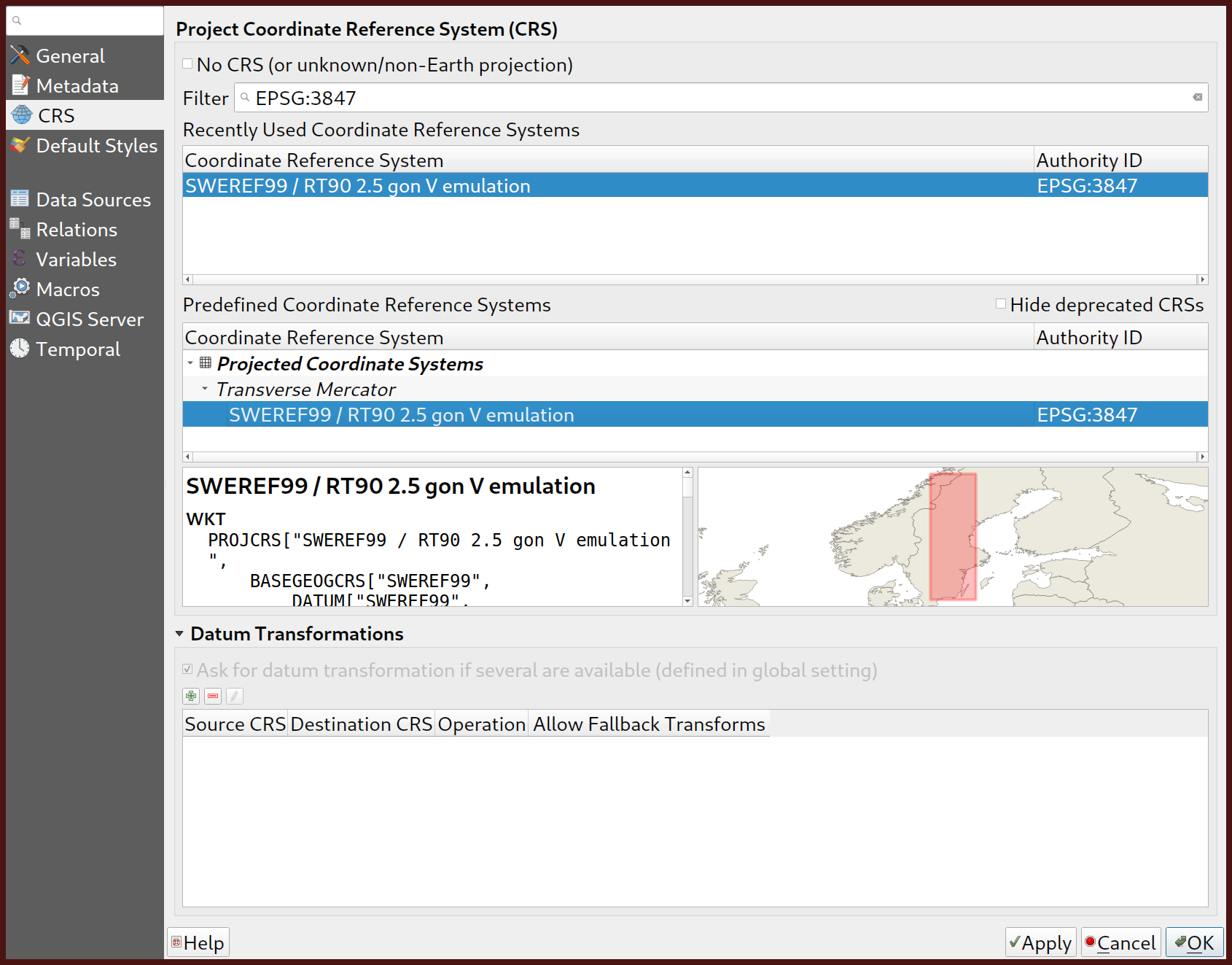 Setting the project CRS
 Selecting all layers
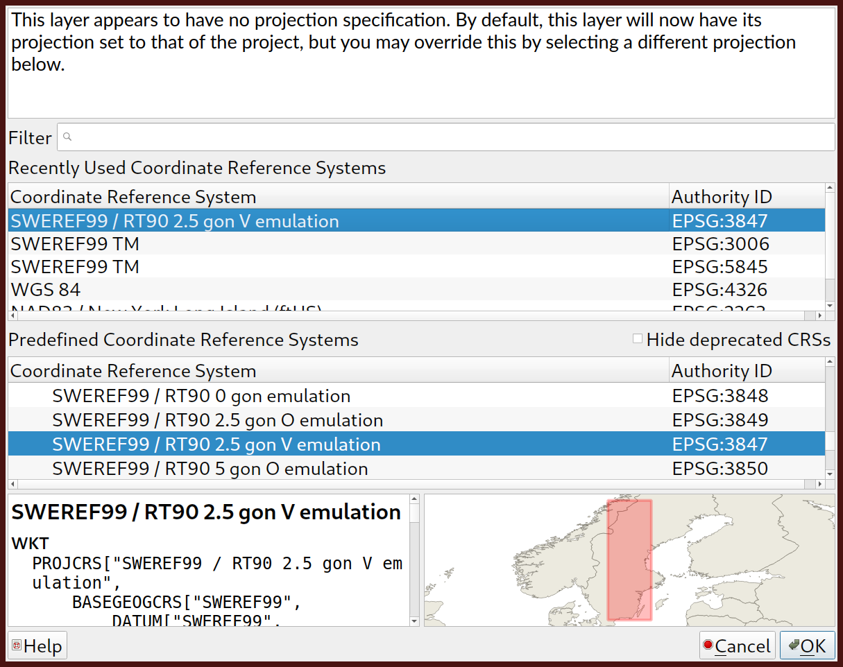 Selecting CRS for layers